← 返回画廊
REFERENCE IMAGE INSTRUCTION: Use the uploaded product photo
提示词来自 @ZaraIrahh 的原推 ↗ · ❤️ 325 · 版权归原作者所有
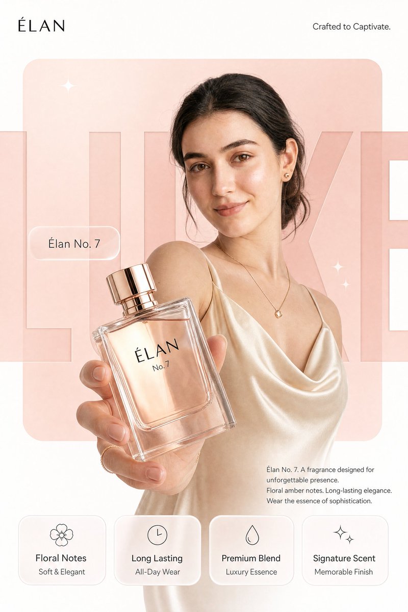
REFERENCE IMAGE INSTRUCTION: Use the uploaded product photo as the exact source of truth for the product's appearance, color, finish, branding, and form factor. Do not invent or alter any product detail. Reproduce it with photorealistic precision.
---
Create a photorealistic premium [PRODUCT CATEGORY] campaign poster in a 4:5 vertical aspect ratio. Design it as a clean global OOH, digital, and social campaign layout with strict grid alignment, premium white space, and precise typography. The campaign idea is "[CAMPAIGN TAGLINE]", but do not render that phrase as visible text.
Use a strict 12-column poster grid with 6% outer margins. Keep all text aligned to this grid. The image has four layers: background shape, giant background typography, subject/product photography, and clean graphic text overlays.
BACKGROUND: Pure matte white canvas. Place one large rounded-rectangle block behind the subject, occupying roughly 70% of the poster height and 76% of the width, centered slightly above the middle. The block uses a controlled [PRIMARY BRAND COLOR] gradient, glowing gently from top-left to bottom-right. Behind the subject and product, place giant cropped typography reading "[BACKGROUND HERO WORD]" in ultra-bold geometric sans-serif letters.
SUBJECT AND PRODUCT: [DESCRIBE MODEL OR SUBJECT]. Shoot from a slightly low hero angle. Body angled for depth, face turned toward the viewer with direct eye contact. One hand extends toward the camera holding the product from the uploaded reference image. The product is the dominant foreground object, slightly tilted to reveal [KEY PRODUCT DETAIL]. Keep the product sharp with realistic surface reflections, material texture, faint micro-details, and soft bloom around premium features. Keep the model's face readable behind it.
LIGHTING: Soft studio key light from front-left, warm rim light from the right, and subtle [PRIMARY BRAND COLOR] bounce from the background block. Skin remains natural and non-airbrushed with realistic catchlights. Product edges have clean [MATERIAL FINISH] highlights. Shadows are soft and controlled.
TYPOGRAPHY OVERLAY: All text must be flat, crisp, perfectly aligned graphic typography. Render exactly these text elements once, with no extra text:
Top left, small black logo: [BRAND LOGO NAME/MARK]
Top right, thin sans-serif: "[BRAND SUB-TAGLINE]"
Mid left, glassmorphism pill: "[PRODUCT NAME]"
Large background type: "[BACKGROUND HERO WORD]"
Bottom right body copy, small clean sans-serif:
"[PRODUCT NAME]. [POWER STATEMENT]
[FEATURE 1]. [FEATURE 2].
[CLOSING LINE]"
BOTTOM FEATURE STRIP: Place four equal-width glass-white rounded cards along the bottom, aligned to the grid, same height, same spacing, same baseline alignment. Each card has one minimal line icon above the heading. Render exactly:
Card 1: "[FEATURE HEADING 1]" / "[FEATURE SUBLINE 1]"
Card 2: "[FEATURE HEADING 2]" / "[FEATURE SUBLINE 2]"
Card 3: "[FEATURE HEADING 3]" / "[FEATURE SUBLINE 3]"
Card 4: "[FEATURE HEADING 4]" / "[FEATURE SUBLINE 4]"
GRAPHIC DETAILS: Two or three small sparkle icons only, subtle grain, soft glassmorphism, controlled [PRIMARY BRAND COLOR]-white-[ACCENT COLOR] palette, no neon, no oversaturation.
🖼️ 参考图(最多 3 张,选填):