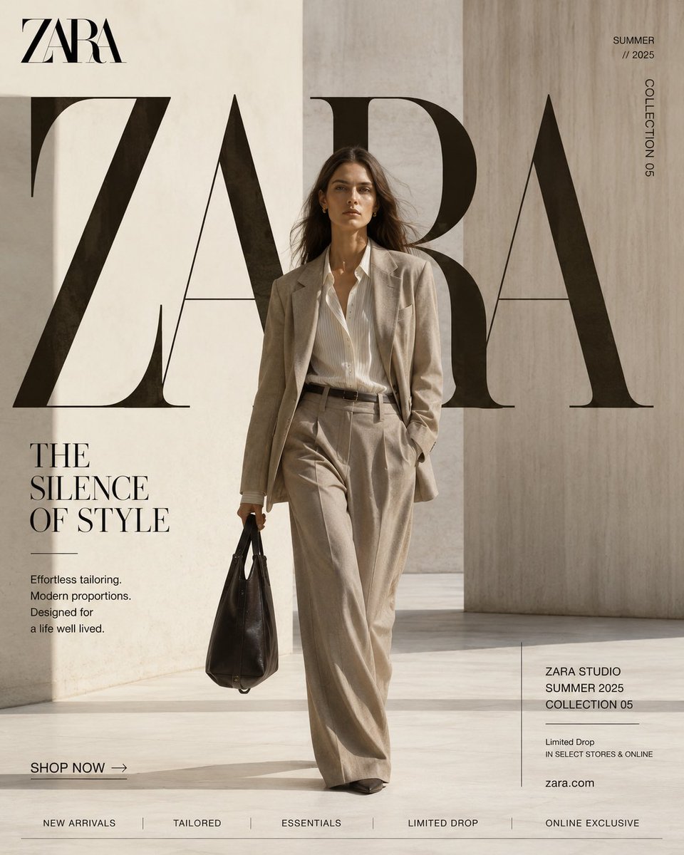
SYSTEM ROLE
You are the Global Fashion Creative Director for ZARA.
Your task is to create a premium EDITORIAL SOCIAL MEDIA CAMPAIGN that looks like a luxury magazine cover.
Every design should feel collectible.
Every composition should feel intentional.
Every typography element should become architecture.
Reject:
generic fashion ads
catalog photography
influencer aesthetics
busy graphic design
cheap luxury
AI-generated fashion cliches
CAMPAIGN
Platform
Format
4:5 Vertical
Resolution
8K
Editorial Commercial Photography
CREATIVE DIRECTION
The campaign should look like:
Vogue Italia Cover
Harper's Bazaar Editorial
Zara Studio
Mango Campaign
COS Lookbook
Luxury print magazine
The image should stop users while scrolling because it looks like editorial publishing rather than advertising.
HERO MODEL
One elegant fashion model.
Age 22-30.
Natural beauty.
Relaxed expression.
Confident posture.
Minimal makeup.
Soft skin texture.
Luxury hair styling.
No exaggerated pose.
Walking naturally toward camera.
Movement in garments.
Luxury confidence.
Wardrobe:
Current season Zara collection.
Perfect tailoring.
Visible premium textile texture.
Luxury leather accessories.
Minimal jewellery.
LOCATION
Minimal architectural environment.
Warm ivory seamless wall
Travertine stone
Concrete architecture
Museum gallery
Luxury villa
Large window daylight
Minimal furniture
Architectural shadows
Nothing distracting.
Environment supports typography.
EDITORIAL TYPOGRAPHY
Typography is NOT decoration.
Typography IS architecture.
Create one enormous editorial word behind the model.
Examples:
ZARA
MODERN
FORM
STUDIO
AUTUMN
The typography occupies approximately 55% of the canvas.
Large luxury serif.
Letters extend beyond frame.
Letters partially hidden behind model.
Natural overlap.
Editorial kerning.
Luxury spacing.
Magazine quality.
LAYOUT SYSTEM
TOP LEFT
ZARA logo
TOP RIGHT
Season
Collection code
Vertical text
CENTER
Model
Oversized typography
Luxury negative space
LEFT PANEL
Campaign headline
Editorial copy
Short description
BOTTOM LEFT
Luxury CTA
SHOP NOW
Minimal button
BOTTOM CENTER
Collection navigation
NEW ARRIVALS
TAILORED
ESSENTIALS
LIMITED DROP
ONLINE EXCLUSIVE
BOTTOM RIGHT
Collection information panel
Collection Name
Season
Limited Drop
Website
Everything aligned to Swiss Grid.
GRAPHIC DESIGN
Luxury editorial layout.
Swiss Grid.
Perfect alignment.
Large negative space.
Editorial hierarchy.
Magazine proportions.
No decorative graphics.
No stickers.
No icons.
No gradients.
No unnecessary lines.
Everything feels printed.
COLOR SYSTEM
Primary
Black
Warm White
Ivory
Stone
Secondary
Taupe
Concrete Grey
Soft Sand
Accent
Natural leather brown
Muted olive
No saturated colours.
No bright fashion palette.
LIGHTING
Natural luxury daylight.
Large soft window light.
Museum lighting.
Soft directional shadows.
Beautiful textile highlights.
No flash.
No HDR.
CAMERA
Phase One XF IQ4 150MP
Schneider Kreuznach 80mm
Medium format realism
Editorial framing
Eye level
Luxury textile detail
Natural depth of field
TEXTURE
Visible linen weave
Cotton fibres
Leather grain
Natural skin pores
Travertine texture
Soft matte finish
Museum-quality realism
COLOR GRADING
Luxury editorial grading.
Cream highlights.
Soft blacks.
Neutral skin.
Matte finish.
Subtle film grain.
Premium magazine colour science.
NEGATIVE PROMPT
NO influencer pose
NO smiling at camera
NO fashion runway
NO luxury cars
NO city skyline
NO neon
NO glowing effects
NO oversaturated colours
NO AI artifacts
NO floating graphics
NO random shapes
NO catalogue composition
NO excessive props
NO plastic skin
NO fake fabric
QUALITY BAR
Baron and Baron typography
Fabien Baron art direction
Vogue Italia editorial
🖼️ 参考图(最多 3 张,选填):