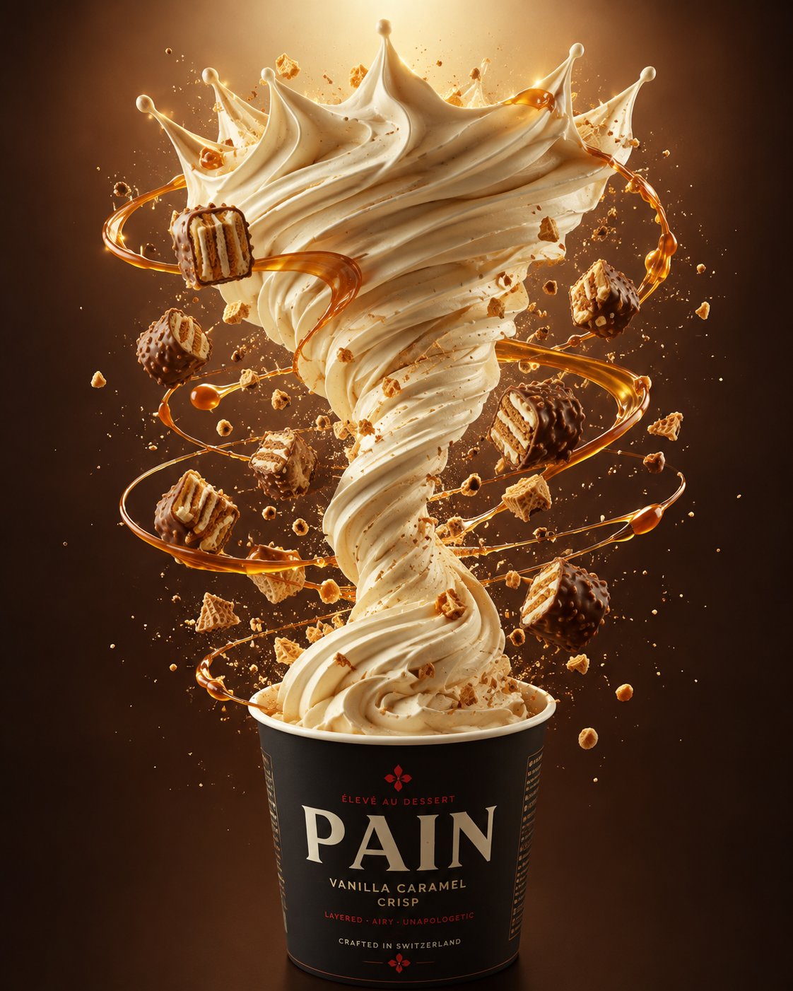
Create an ultra-premium flagship advertising key visual for PAIN, designed to feel like a global dessert campaign photographed for a major international launch.
Hero product:
One branded PAIN dessert cup positioned in the lower center of a tall vertical composition. The camera is slightly elevated and looking downward so the cup opening and dessert surface remain clearly visible.
The cup is the visual anchor.
From the center of the cup, create one continuous sculptural vortex of silky vanilla cream rising vertically through the composition.
The cream should accelerate upward in a clean central motion, then expand near the top into a dramatic crown-like bloom.
The result must feel iconic and instantly readable:
PAIN cup → rising cream vortex → premium dessert crown.
Do not create a chaotic splash.
Product branding
Design the cup as a premium PAIN brand totem.
Use an original luxury packaging system featuring:
bold PAIN wordmark
strong black foundation
warm ivory details
refined deep-red accents
minimal premium graphic elements
clean modern typography
matte-coated paper texture
sharp professional print quality
The branding should feel bold, youthful and globally premium.
Do not copy any existing brand identity, logo, packaging or slogan.
Dessert motion
Build the entire composition around a single vertical axis.
The vanilla cream should appear naturally whipped, dense and aerated with:
silky extrusion ridges
soft folds
rounded peaks
subtle micro-air texture
believable weight and gravity
natural creamy sheen
Around the cream, create glossy caramel ribbons orbiting upward in elegant elliptical loops.
The caramel should visually guide the viewer from the cup toward the crown.
Add controlled chocolate-coated wafer bites, crisp biscuit fragments and fine toasted crumbs following the same rising orbital trajectory.
Every airborne element must feel intentionally art-directed.
No random debris.
Appetite appeal
Make every food texture look physically delicious.
Caramel: translucent amber-gold, glossy, thick, elastic and luxurious.
Chocolate: rich milk-chocolate coating with subtle satin reflections.
Wafers: crisp visible layers, creamy filling and realistic broken edges.
Crumbs: naturally varied, lightly toasted and sharply detailed.
The dessert should feel fresh, touchable and edible rather than digitally simulated.
Lighting
Use world-class commercial food photography lighting.
Warm top-front key light.
Soft controlled fill.
Precise rim and specular highlights across:
cream ridges
caramel ribbons
chocolate shells
cup edges
Create premium gloss without making the food look oily.
Every highlight should feel intentionally retouched for a flagship campaign.
Color direction
Use a sophisticated premium palette:
vanilla ivory + caramel amber + toasted biscuit gold + milk-chocolate brown + warm copper + deep mocha
The PAIN packaging introduces:
black + ivory + refined deep red
Maintain strong visual contrast between the cup, cream and background.
Background
Use a smooth caramel-to-deep-mocha studio gradient with a subtle luminous halo behind the upper cream crown.
Keep the set completely minimal.
No table.
No spoon.
No extra packaging.
No unnecessary props.
Only subtle atmospheric crumbs and micro-particles may remain for depth.
Composition
Strict vertical hero composition.
Cup centered in the lower third.
Cream vortex occupies the central column.
Cream crown dominates the upper half.
Caramel orbits create elegant depth around the central structure.
Maintain generous negative space and strong silhouette separation.
The image should remain visually powerful even when viewed small on a phone or from billboard distance.
Campaign feeling
The final image should feel:
iconic
craveable
sculptural
luxurious
youthful
bold
international
high-fashion
premium
flagship
Think global product launch, not casual dessert photography.
Rendering
Ultra-premium commercial dessert photography, flagship advertising KV, slightly top-down hero camera, photorealistic food textures, sophisticated studio lighting, realistic materials, controlled caramel motion, sculptural vanilla vortex, premium retouching, razor-sharp product detail, polished international campaign aesthetic, 8K.
Avoid
messy splash, sideways explosion, random flying food, weak cup presence, eye-level camera, low-angle camera, synthetic foam, plastic cream, fake caramel, waxy chocolate, oily highlights, distorted cup, poor typography, copied logos, real competitor branding, cluttered background, cheap fast-food aesthetic, excessive particles, oversaturated colors, muddy shadows, unrealistic gravity, low-detail wafers, generic CGI appearance.
🖼️ 参考图(最多 3 张,选填):