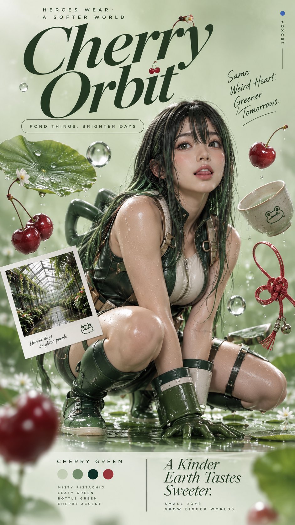
【主题】×【主体】。 将【主体】设计为一张具有成熟品牌艺术指导的 9:16 竖版商业创意海报。保留主体核心识别特征,包括外形、色彩、结构、标志性细节与身份符号。人物角色以真实成年形象呈现,动物保留真实动物形态,物品保持真实产品结构。 【风格核心】 Nature-inspired branding × monochromatic color harmony × photographic cutout collage × floating editorial composition × premium lifestyle advertising × minimalist commercial art direction。 【质感与调色】 每次根据【主题】和【主体】自主选择一种具有高级感的主色,可以来自自然植物、矿物、花卉、果实、泥土或柔和工业色彩。 围绕主色建立统一的低饱和单色系配色系统,通过浅色背景、中等明度主体、深色字体与少量互补暖色点缀形成视觉层级。背景采用细腻的单色渐变,色彩过渡轻柔,明度差异克制。 主体采用真实商业摄影质感,材质细节清晰,包括金属反射、陶瓷釉面、天然木纹、织物纤维、透明材料或人物与动物的真实表面纹理。柔和的大面积漫射照明、轻微边缘反光、精致数字修图与自然接触阴影,呈现干净、细腻、现代的高级广告质感。 【构图与空间】 9:16 竖版,采用具有杂志设计感的三段式视觉结构。 顶部约四分之一画面用于品牌式标题排版,中部以巨大的【主体】作为绝对视觉中心,底部安排简洁的色彩信息、主题说明与品牌式辅助文案。 主体位于画面中央偏下,占据主要视觉面积,具有完整清晰的外轮廓和适度的近距离透视感。 围绕主体悬浮排列 4—6 个与【主题】高度相关的物品、道具或环境片段,由模型自主选择,包含不同体积、材质与形状。部分道具位于主体后方,部分沿主体两侧展开,形成自然的不对称平衡。 其中可包含一张略微倾斜的拍立得式场景照片,展示与主题相关的真实生活空间;搭配圆形器皿、几何物体、天然材质道具或主题符号,使二维摄影拼贴产生丰富而克制的空间层次。 每个物体保持独立清晰的摄影轮廓,局部轻微重叠,呈现经过精心艺术指导的悬浮静物组合。 【字体与信息设计】 顶部使用小号大写无衬线文字作为引导标题,下方搭配一行大型优雅斜体衬线主标题,建立鲜明的字体对比。根据【主题】自主创作简洁、有品牌传播力的标题文案。 标题下方可设置一个圆角胶囊形的短文案标签。 底部采用左右分栏,一侧展示本次主色的创意命名,另一侧使用大型斜体衬线字呈现简短主题口号。 字体颜色从主色系中选择最深的颜色,确保清晰易读;文字、道具和背景共同组成完整的平面设计系统。 【最终视觉】 一张真实产品广告摄影与数字拼贴艺术相结合的国际品牌主视觉海报。统一的自然系随机配色、巨大的中心主体、精致悬浮道具、丰富的材料对比、柔和渐变背景与高级 Editorial 字体编排,整体具有现代生活方式品牌、设计杂志与创意广告企划的视觉完成度。 画面右侧约 5% 边缘位置保留极小写 voxcat 签名,末尾搭配一个青金石蓝小圆点。
灵感画廊
看真实作品,读完整提示词,也可以直接从模板开始。
提示词摘自 X (Twitter) 等公开社交媒体,版权归原作者所有。

 选效果 · 拼指令
#ad
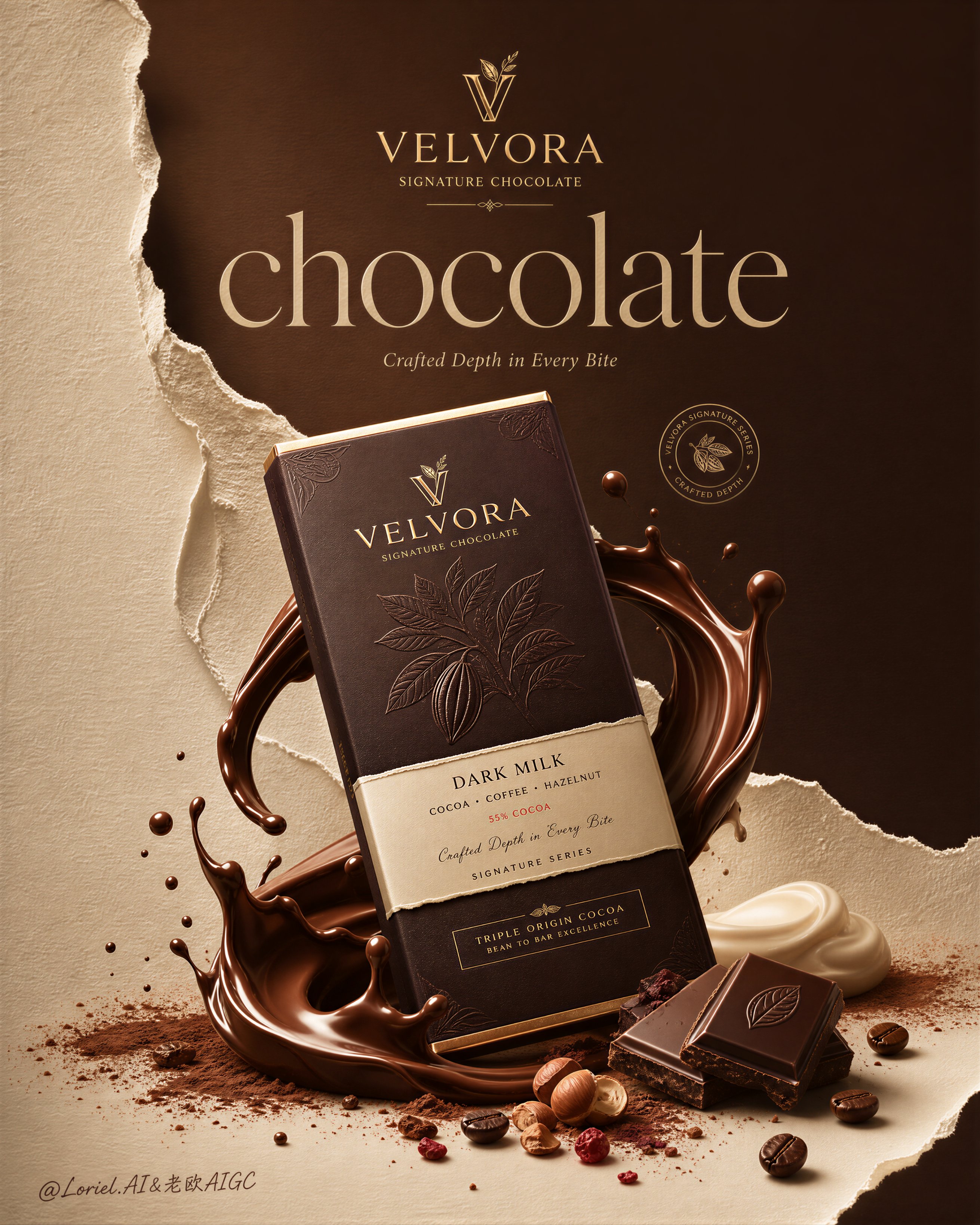
Create the second poster in the same ultra-premium chocolate campaign series for the fictional luxury brand VELVORA, merging the tactile richness of Milk Cloud Orbit with the series discipline of Cream Halo Transit, while dramatically expanding negative space, emerald-and-gold contrast, and torn-paper layering for a more iconic flagship-brand presence. The image must feel like a collector-edition international confectionery campaign: highly realistic, visually striking, editorial, luxurious, and unmistakably premium. Preserve the same core series structure of one dominant upright hero package in the lower center, a large broken chocolate slab rising behind it, and sculptural liquid motion wrapping the base, but let the overall composition breathe more, feel rarer, and read more like a brand masterpiece than a standard food ad. Use English-first branding only. Core composition: Use a tall vertical poster composition with one front-facing hero chocolate package standing upright in the lower center, fully visible and clearly dominant. Behind it, place a large broken chocolate slab in the upper-right background, angled with elegant fractured geometry and restrained flying crumbs. Around the lower portion of the package, build controlled molten splash forms in dark chocolate and pale cream, wrapping the base with premium sculptural motion. Preserve the same family structure as the previous poster, but increase the amount of breathing room around the hero product so the composition feels calmer, more expensive, and more iconic. Series continuity: This must clearly read as poster number two in the same VELVORA luxury chocolate series. Preserve the same brand hierarchy, same premium packaging logic, same refined ingredient world, same “hero package + broken slab + splash + editorial type” structure, and same tactile realism. The difference is that this second poster feels sharper, more graphic, and more jewel-like, with a cooler, rarer campaign atmosphere and stronger visual authority. Milk Cloud Orbit enhancement: Push tactile richness to a higher level. The molten chocolate must feel thicker, silkier, and more luxurious, with richer glossy drag and physical weight. The packaging embossing, foil details, chocolate fracture texture, cocoa powder dust, cream softness, and bean surface oil sheen must all be heightened. Every surface should feel touchable, dense, and collector-grade. The image should deliver a stronger “luxury indulgence” impact at first glance. Cream Halo Transit refinement: Strengthen the sense that this poster belongs to a highly disciplined premium chocolate series. The package design must feel like part of a mature family system with elegant sub-line hierarchy, consistent foil treatment, and polished luxury structure. The layout, typography, product placement, and ingredient logic should all feel more controlled and brand-system driven, as if this is one chapter in a refined multi-poster campaign. Brand and title system: Use the fictional premium identity: Brand: VELVORA Product line: SIGNATURE CHOCOLATE Hero title: chocolate Tagline: Velvet Depth. Pure Impact. Typography must feel editorial, luxurious, and beautifully composed, using a high-end serif main title, refined supporting text, and a discreet emblem or premium logo mark. The type should feel more like an international beauty or fashion campaign adapted to chocolate branding than a retail confectionery ad. Color direction: This version must push the emerald-green and antique-gold campaign identity much harder. Replace ordinary cocoa-led poster feeling with a rarer luxury palette built from deep emerald-green fields, warm ivory paper tones, antique gold accents, and rich dark chocolate browns. The contrast between emerald and gold must feel clear, elegant, and premium, never loud or cheap. The chocolate remains richly realistic and dark, but the surrounding design language must unmistakably signal a new main color system. Negative space and graphic elegance: This is critical. Expand the negative space significantly so the composition feels more prestigious and brand-led. Let the hero package, typography, and broken chocolate slab breathe inside a more spacious poster field. The unused space must feel intentional, graphic, and expensive, making the central product read more like an icon. Avoid overcrowding. The poster should feel confident enough to leave room empty. Torn-paper layering: Push the torn-paper design logic much further. Build the background from large, elegant ripped-paper planes or layered peeled-stock panels, dividing the frame into premium emerald-green and warm ivory zones. The torn edges must feel tactile, fibrous, dimensional, and art-directed, like luxury printed stock physically ripped as part of the campaign identity. This torn-paper layering must become a key visual asset, not just a minor backdrop detail. Packaging design: Design the hero package as a high-end luxury chocolate wrapper or box with refined embossed details, elegant foil hierarchy, tactile printing, and premium label structure. The package must integrate beautifully with the emerald-and-gold direction while remaining unmistakably part of the same VELVORA series. It should feel expensive, sharp, collectible, and perfectly printed. Chocolate realism: The chocolate slab behind the package must feel dense, refined, sharply broken, and physically believable, with clean fracture planes, delicate crumb debris, and luxurious snap texture. Add only a few smaller broken pieces near the bottom to reinforce realism and appetite. The chocolate must feel rich and premium, never waxy, never plastic. Ingredient and flavor world: Support the composition with a restrained ingredient environment: cocoa powder dust, cocoa beans, roasted nuts, soft cream accents, and tiny cocoa nib fragments. Everything must feel compositionally edited, luxurious, and highly intentional. No clutter, no random garnish overload. Each element should enhance richness, craft, and indulgence. Fluid motion: Use sculptural liquid motion at the base of the package: one dark molten chocolate splash paired with one pale cream or milk-velvet splash. The splashes must feel thick, glossy, elegant, and physically believable, with beautiful curves, droplets, and weight. They should intensify impact without overwhelming the poster. Lighting: Use extremely delicate high-end commercial lighting with soft cinematic shaping. Highlights must glide over the embossed packaging, gold details, broken chocolate slab, cream splash, molten chocolate, and cocoa dust with graceful rolloff. Maintain strong dimensionality and luxurious contrast while preserving softness and elegance. Material realism: Push realism to the maximum. Packaging must feel embossed and tactile. Chocolate must feel dense and premium. Molten splash must feel heavy and glossy. Cream must feel silky. Cocoa powder must feel feather-light and dry. Beans must show real crack texture and subtle oil sheen. Nuts must feel roasted and precise. Torn-paper edges must feel fibrous, layered, and physically real. Mood: luxury chocolate campaign, collector-grade indulgence, emerald-gold prestige, editorial confectionery branding, tactile richness, spacious graphic elegance, jewel-like premium atmosphere Rendering style: ultra-premium chocolate advertising poster, second poster in same VELVORA series, Milk Cloud Orbit tactile enhancement, Cream Halo Transit series discipline, upright hero package, broken chocolate slab behind, larger negative space, stronger emerald-and-gold contrast, expanded torn-paper layering, molten chocolate splash, cream accent splash, refined editorial typography, soft cinematic lighting, world-class luxury brand campaign, 8k Negative prompt: cheap candy packaging, supermarket flyer look, cluttered ingredients, weak torn-paper design, overcrowded composition, cartoon chocolate, plastic-looking liquid, harsh lighting, low-detail wrapper, crude bold fonts, messy layout, low-resolution texture, childish branding, cheap green tone, weak gold detailing
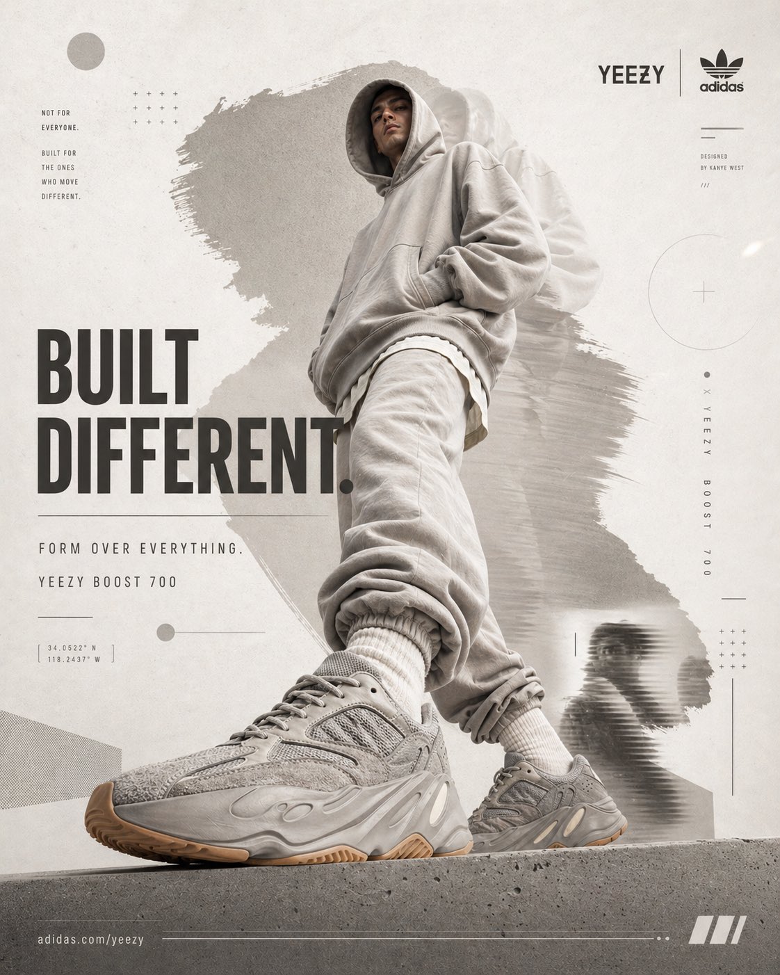
[BRAND NAME = ADIDAS × YEEZY] [PRODUCT = YEEZY BOOST 700] [COLORWAY = MONOCHROME GREY / OFF-WHITE / GUM SOLE] Act as a Social Media Art Director and Digital Collage Artist specializing in bold, youth-oriented brand content for Instagram and digital campaigns. PHASE 1: CONCEPTUAL FRAMEWORK Create a dynamic digital collage where minimalism collides with dominance. This is controlled rebellion — not loud, but undeniable. Aesthetic: - Anti-polished but precise - Reduced chaos, increased weight - Sculptural presence + layered texture - Editorial meets street energy Core Idea: “BUILT DIFFERENT.” PHASE 2: MODEL & PHOTOGRAPHY - Subject: One model (18–30), neutral expression, high-fashion posture - Pose Energy: 70% attitude, 30% natural (forward step, grounded stance) - Outfit: Monochrome oversized Yeezy-style silhouette - Hero Product: Yeezy Boost 700 (primary visual anchor) - Photography Style: Editorial cutout, clean edges - Camera Angle: Slight low angle (authority perspective) - Crop: 3/4 body, shoe clearly dominant in foreground - Background Removal: Clean extraction for collage layering PHASE 3: COLOR BLOCKING FOUNDATION - Primary Color Blob: Muted stone grey (hero tone) - Secondary Accent: Soft beige / off-white haze - Shape Style: Irregular brush / soft torn edges (not geometric) - Coverage: 40–50% of composition - Texture: Subtle grain + fabric-like noise (15%) - Placement: Behind model, slightly diagonal to frame silhouette PHASE 4: GRAPHIC ELEMENTS LAYER Add 3–5 abstract elements: - Soft gradient shapes - Minimal architectural lines - Faint circular forms - Subtle shadow duplication (depth echo) - Light distortion blur fragments Rules: - Color Palette: Neutral tones only (grey / beige / off-white) - Placement: Asymmetric (top-left + bottom-right bias) - Scale: Small (5%) + medium (15%) - Avoid center clutter - Maintain clean, intentional layering Aesthetic: Refined chaos — visible but controlled PHASE 5: TYPOGRAPHY INTEGRATION - Brand Logo: Top-right (Adidas minimal mark) - Headline: “BUILT DIFFERENT.” - Supporting Copy: “FORM OVER EVERYTHING.” - Micro Copy: “YEEZY BOOST 700” - Type Style: Bold modern sans-serif - Treatment: Mostly aligned, slight rotation (max 2°) - Hierarchy: Headline → Product → Supporting → Logo PHASE 6: TEXTURE & BACKGROUND - Base Layer: Warm off-white / light grey (RGB 245–248) - Texture: Subtle paper grain + soft noise - Treatment: Texture should be felt, not dominant PHASE 7: COMPOSITION RULES - Layout: Asymmetric balance (model slightly off-center) - Breathing Room: 20–25% negative space - Layering Order: Background → Color blob → Graphics → Model → Typography - Focal Point: Product (shoe) = 60% Graphics + model = 40% - Movement: Subtle diagonal flow (not aggressive) PHASE 8: BRAND INTELLIGENCE Adidas × Yeezy: - Less noise, more intention - Presence over movement - Design as identity - Controlled visual disruption PHASE 9: SOCIAL MEDIA FOOTER - Minimal bottom strip Content: https://t.co/EFfzIDHxRP - Clean grid layout TECHNICAL SPECS: - Aspect Ratio: 4:5 - Resolution: 2400x3000px - Color Mode: sRGB - High detail, soft contrast - Slight grain allowed - Photography Base: 85mm lens, f/2.8 FINAL OUTPUT MOOD: Dominant. Minimal-chaos. Architectural. High-fashion street authority.
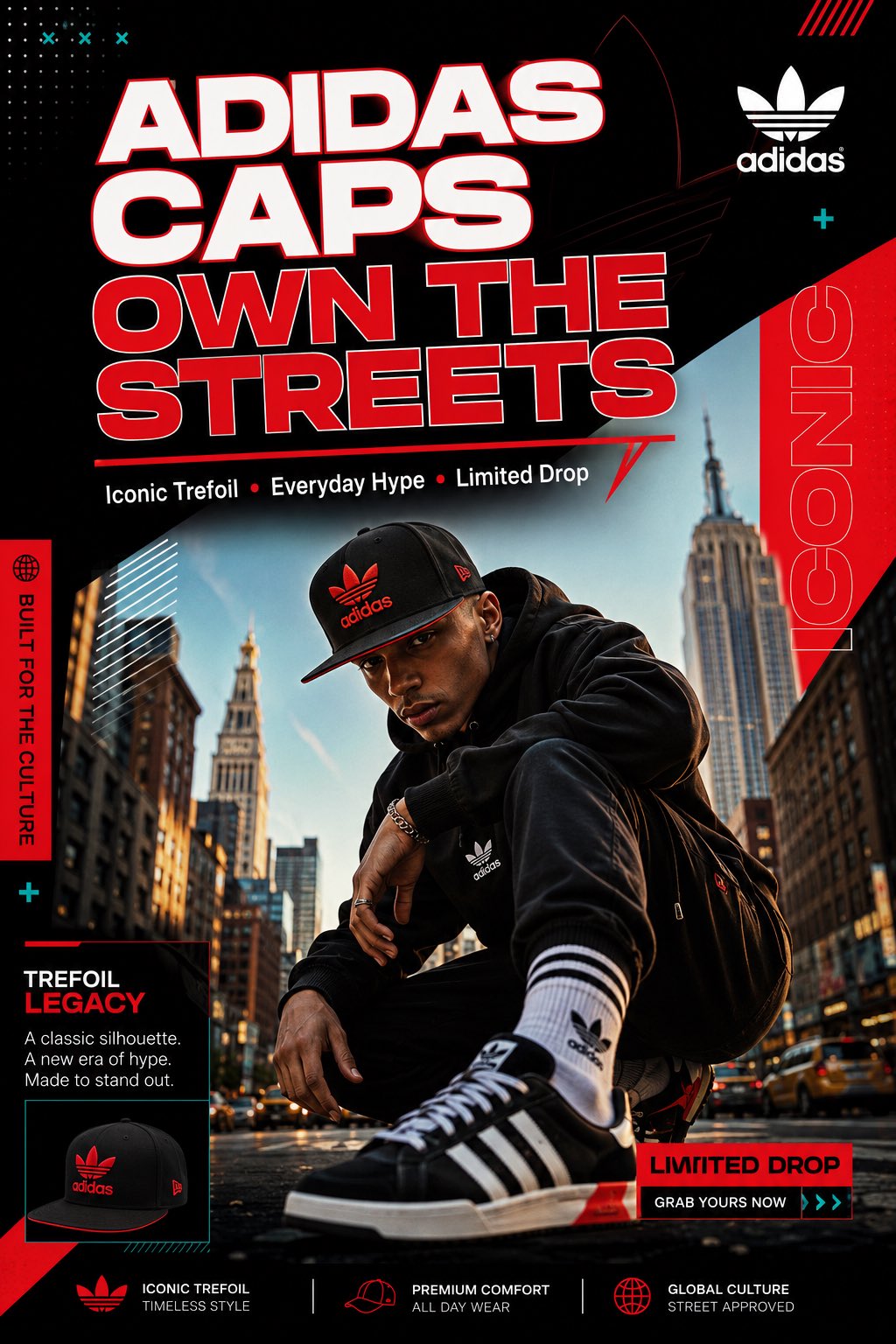
Create one single, scroll-stopping Instagram post (1080x1350 px, portrait) for Adidas caps in a vibrant modern graphic design style: dynamic layout, bold sans-serif typography, geometric shapes and accents, high contrast, clean hierarchy, premium energetic feel with cohesive branding — exactly like the travel agency templates, fintech flyers, cafe collections, and bicycle equipment posts. Subject: Adidas black snapback cap with red trefoil logo and details. Visual style: - Main hero image: Confident model wearing the black Adidas snapback on a vibrant urban NYC street at golden hour, dynamic low-angle shot, streetwear outfit (hoodie + sneakers). - Bold large headline at top: "ADIDAS CAPS OWN THE STREETS" in white with red outline and subtle geometric underline. - Subtle supporting text below: "Iconic Trefoil • Everyday Hype • Limited Drop". - Clean Adidas trefoil logo integrated in corner. - Vibrant cohesive palette: Deep black background with bold red accents, white text, subtle teal geometric overlays for energy. - Aspirational street vibe with high contrast, generous negative space, subtle glows and shadows on the cap for premium feel. - Overall: Professional template look — eye-catching, mobile-first, scroll-stopping. Output a detailed description of the full layout (exact positioning of image, text, accents, colors) so I can recreate it perfectly in Canva or Figma. Make it premium and hype.
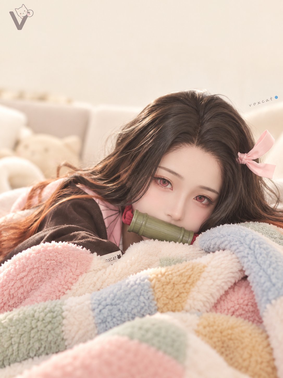
竖版治愈系居家产品广告摄影,柔光低对比、米白奶油基调、马卡龙撞色织物质感为核心视觉基调。画面上方留白用于大号手写毛笔感中文标题字体,赭石棕色。 主视觉为【角色/主体】特写,慵懒趴卧,身体被绒毛毯包裹仅露出头部与上半身,下巴搭在毯子边缘,眼睑微眯,神态安心放松。 毯子为雪尼尔 / 法兰绒质感,粉、浅蓝、浅绿、黄棕色块拼接,纤维蓬松。背景为米白至奶油黄纯色或简约居家场景,沙发轮廓虚化可见。 光源为大面积柔光漫射,无明显硬阴影,高光集中在主体与毯子绒毛上形成发光感。镜头中长焦压缩透视,平视微俯角,浅景深虚化背景。整体高明度低饱和,冷暖均衡。 左上角放置 V 字母与猫形图案构成的小型 Logo;右侧约 5% 边缘位置标注极小写 voxcat,末尾带青金石蓝色小圆点;若主体可佩戴配饰,加入小巧 VOXCAT 吊牌;标识位置固定、尺寸克制,不喧宾夺主。
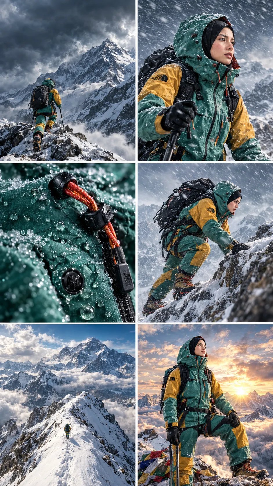
Create an ultra-realistic cinematic outdoor adventure commercial for The North Face waterproof jacket. Begin with a realistic street scene where a delivery person hands a package to a woman wearing a hijab. Transition into an unboxing scene featuring a premium teal and mustard-yellow outdoor jacket. Show the woman traveling by airplane, admiring snow-covered mountain peaks through the window, then embarking on an intense high-altitude mountain climbing adventure. Capture dynamic first-person POV shots of boots stepping through deep snow, gloved hands gripping icy rocks, and the climber ascending steep, rugged mountain slopes. Use dramatic wide-angle shots of towering snowy peaks, swirling clouds, and breathtaking golden sunlight illuminating the mountain summit. Include smooth cinematic transitions into detailed macro shots of the waterproof jacket, highlighting water droplets rolling off the fabric, premium zippers, orange drawcords, technical stitching, and the authentic The North Face logo. End with the climber standing confidently on a snowy mountain summit above a sea of clouds at sunrise. Emphasize adventure, resilience, premium outdoor performance, and exploration. Photorealistic textures, realistic snow physics, natural lighting, atmospheric depth, smooth camera movements, cinematic color grading, professional commercial cinematography, sharp product details, 4K quality, vertical 9:16 aspect ratio.
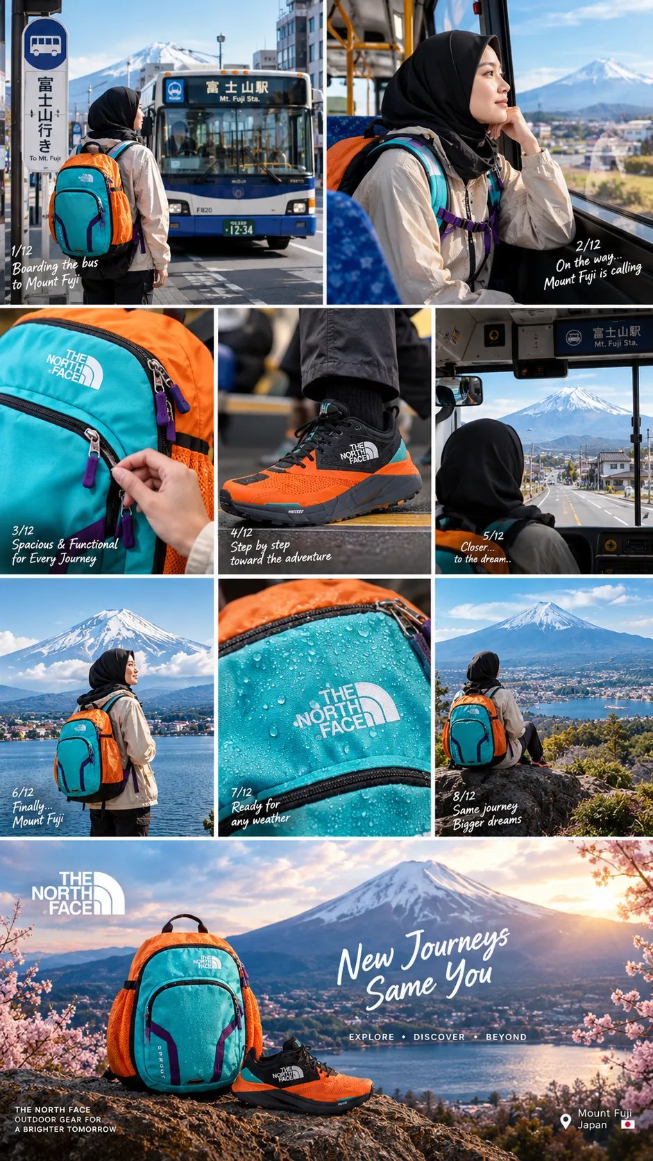
Create a cinematic, ultra-realistic outdoor travel advertisement featuring a young woman wearing a black hijab, a beige oversized jacket, black pants, and vibrant orange-and-black outdoor hiking shoes. She carries a turquoise and orange hiking backpack with purple accents. Scene 1: A cinematic aerial establishing shot of a peaceful Japanese village, narrow streets, traditional houses, electric poles, and the majestic snow-capped Mount Fuji in the background. Smooth forward camera movement with natural daylight. Scene 2: Transition into scenic shots of the woman waiting at a rural Japanese bus stop, with Mount Fuji rising dramatically behind her. Use dynamic diagonal split-screen transitions to showcase different camera angles. Scene 3: Close-up shots of her turquoise hiking backpack, highlighting its fabric texture, colorful compartments, zippers, straps, and practical outdoor design. Capture her adjusting the backpack while standing beside a bus. Scene 4: Show her boarding a local Japanese bus. Use low-angle tracking shots of her orange hiking shoes stepping onto the bus, followed by interior shots as she walks down the aisle and sits comfortably. Scene 5: Capture detailed product shots of the backpack resting beside her on the bus seat. Show her gently touching the backpack, followed by a natural portrait of her smiling while looking out the window. Scene 6: Extreme close-up macro shots of the hiking shoes, textured soles, waterproof-looking fabric, and the backpack's water-resistant surface covered in tiny water droplets. Use shallow depth of field and premium commercial lighting. Scene 7: The woman walks confidently along a beautiful lakeside trail with Mount Fuji in the distance. Her backpack moves naturally with her steps, and the camera follows her using smooth cinematic tracking shots. Final Scene: A breathtaking wide shot of the woman standing near a scenic Japanese lakeside village during golden hour, cherry blossoms framing the landscape and Mount Fuji in the background. Finish with a premium outdoor adventure advertising aesthetic. Visual Style: Photorealistic, premium outdoor brand commercial, cinematic color grading, natural lighting, realistic fabric physics, smooth camera movement, sharp product details, seamless transitions, varied focal lengths, 4K quality, vertical 9:16 aspect ratio. Maintain consistent character appearance, clothing, backpack colors, and footwear throughout the entire video. Preserve realistic anatomy and natural walking movements. Keep product branding consistent with the reference footage.
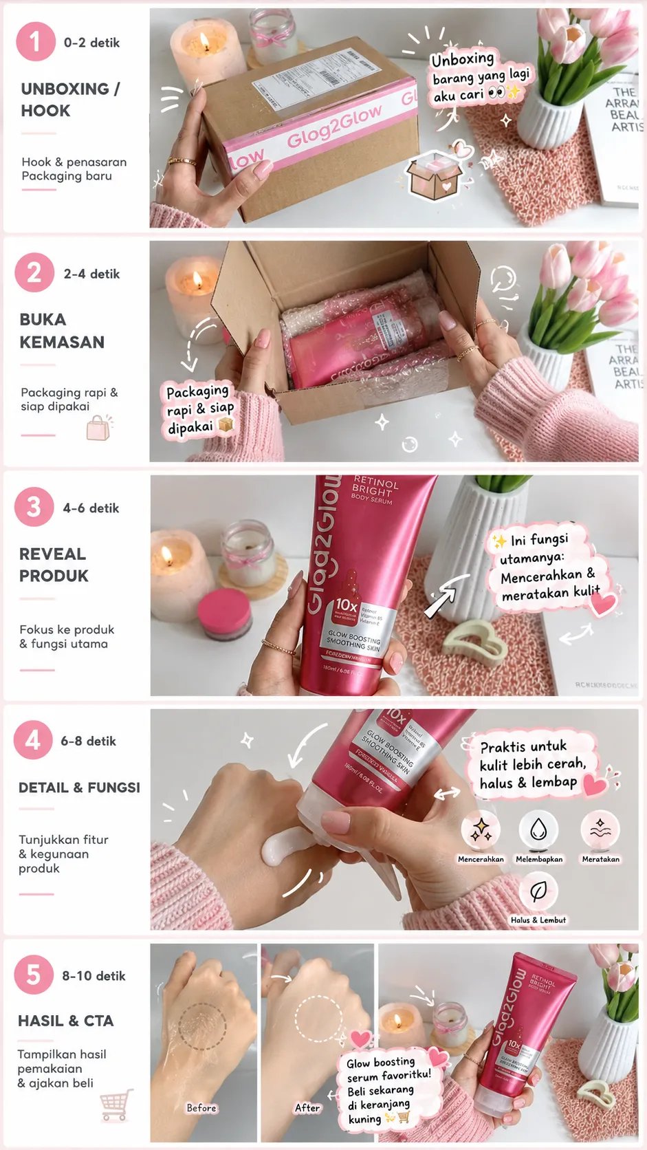
Create a vertical storyboard sheet in a 9:16 aspect ratio for a 10-second TikTok/Shopee Affiliate product advertisement video, consisting of exactly 5 different scenes, with each scene lasting approximately 2 seconds. Use the product from the reference photo as the main product. Keep the product 100% identical to the reference photo, including its shape, color, size, material, texture, pattern, logo, packaging, and all other important details.
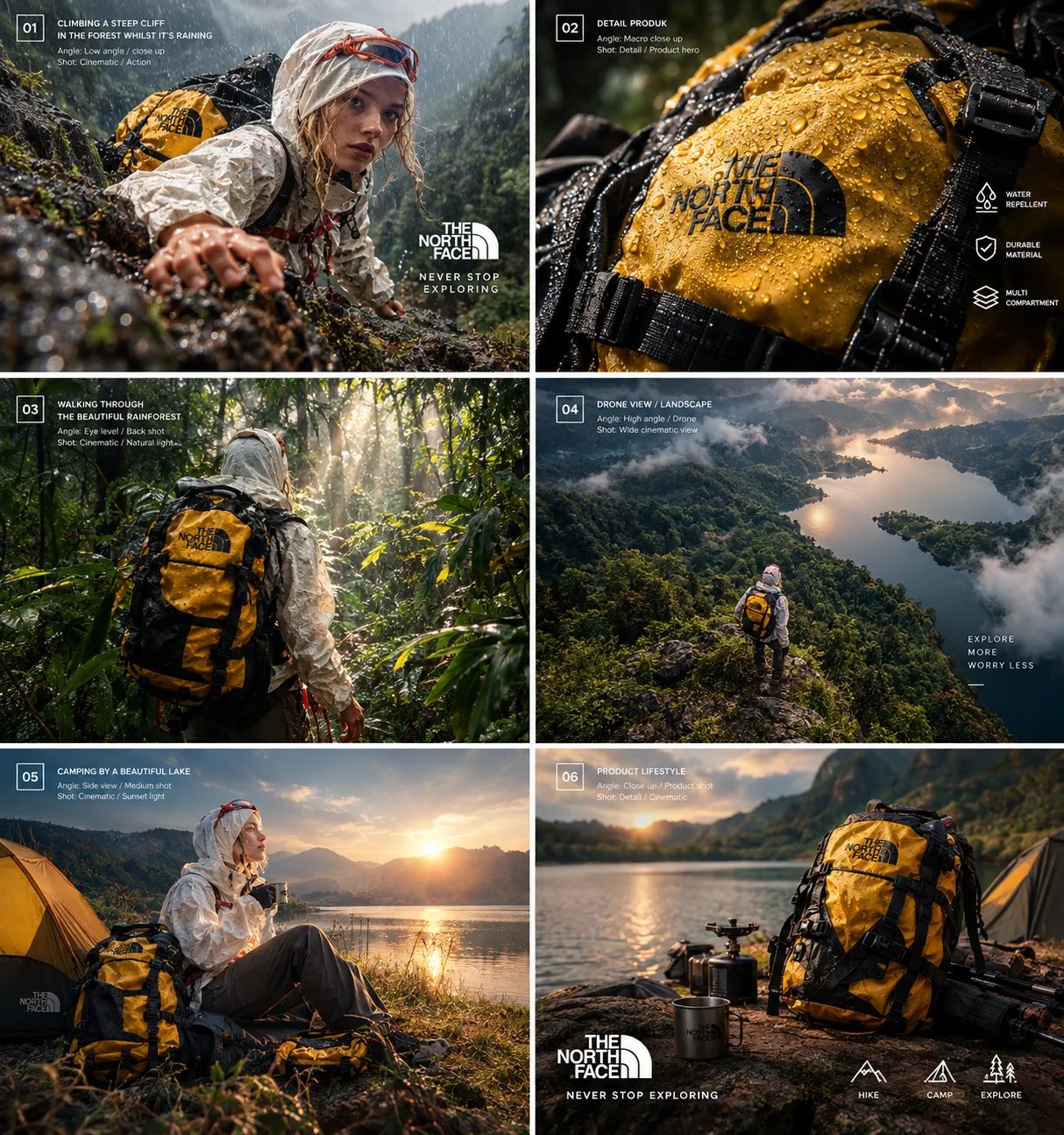
Cinematic Outdoor Adventure Backpack Commercial — Exact Video Recreation Prompt Create an ultra-realistic, cinematic outdoor adventure advertisement, exactly 54 seconds long, in vertical 9:16 format, using premium outdoor-brand commercial cinematography Visual Style: Photorealistic 4K quality, dramatic mountain landscapes, lush green forests,rugged dark rock formations, crystal-clear lakes, natural sunlight, atmospheric mist, realistic textures, smooth cinematic camera movements, sophisticated color grading, and seamless transitions. Maintain consistent character appearance, clothing, and backpack design throughout the video. SHOT 1 — Majestic Mountain Opening (0:00–0:04) Open with a breathtaking wide aerial view of rugged mountain peaks rising above layers of clouds. Golden sunlight illuminates the distant landscape as the camera slowly glides forward, establishing a peaceful, adventurous atmosphere. SHOT 2 — Cinematic Landscape Transitions (0:04–0:09) Transition through dynamic geometric and diagonal visual wipes, revealing dramatic mountain slopes, dense evergreen forests, and textured rocky terrain. Use elegant, rhythmic editing with smooth camera movement. SHOT 3 — Entering the Forest (0:09–0:15) Show a female hiker wearing a light-colored outdoor outfit, a beige headscarf, and a bright mustard-yellow technical hiking backpack with black straps and multiple compartments. Film her from behind as she walks along a narrow trail through a lush green forest. Sunlight filters through the canopy, highlighting the backpack's fabric and realistic details. SHOT 4 — Hiker Close-Up (0:15–0:20) Cut to a close-up of the woman navigating the rocky trail. She crouches slightly, looks ahead with a focused expression, and carefully moves through the vegetation. Her sunglasses rest on top of her headscarf. Capture natural facial expressions, realistic fabric movement, and detailed foliage. SHOT 5 — Climbing the Rugged Rock Face (0:20–0:29) Show the woman climbing a steep, dark rocky mountainside while wearing the same yellow backpack. Use alternating medium shots and close-ups of her hands gripping the rock, her boots finding secure footholds, and her body moving carefully upward. Include a dramatic side angle showing the backpack against the rugged cliff and misty green mountains in the distance. SHOT 6 — Backpack and Climbing Details (0:29–0:34) Capture tight product-focused shots of her hands touching the rough rock surface and the backpack moving naturally with her body. Emphasize durable-looking fabric, reinforced stitching, adjustable black straps, sturdy buckles, zipper compartments, and realistic material textures. SHOT 7 — Epic Mountain Summit (0:34–0:40) Cut to an expansive cinematic landscape of layered mountains, a distant lake, and a sea of clouds beneath a bright sky. Show the hiker standing on a narrow rocky ridge, appearing small against the immense scenery. Use a wide establishing shot and a slow pullback to emphasize the scale of nature and the spirit of exploration. SHOT 8 — Peaceful Lakeside Moment (0:40–0:44) Transition to a serene lakeside scene in warm golden sunlight. The woman sits on a rocky shoreline beside the water, resting after her journey with the yellow backpack prominently visible. Capture shimmering water reflections, gentle ripples, and a calm, peaceful atmosphere. SHOT 9 — Premium Backpack Product Reveal (0:44–0:49) Use bold diagonal transitions and close-up product imagery to showcase the mustard-yellow backpack. Present it against a dramatic, cool-toned outdoor background. Highlight the backpack's silhouette, front pocket, black webbing, buckles, zippers, fabric texture, and functional construction with polished commercial lighting. SHOT 10 — Waterproof Fabric Detail (0:49–0:52) Show an extreme macro shot of water droplets beading on the yellow backpack fabric. The droplets glisten under controlled studio-style lighting, emphasizing the textured material and water-repellent appearance. Use shallow depth of field and crisp product photography. SHOT 11 — Final Brand Hero Shot (0:52–0:54) End with the yellow backpack floating visually against a dark, dramatic blue-black background with subtle atmospheric particles and a cool cinematic glow. Illuminate the backpack from above to emphasize its shape, straps, and construction. Display the authentic “THE NORTH FACE” logo near the bottom, matching the reference video's final branding composition. Finish with a clean, premium advertising aesthetic. Camera and Editing: Combine aerial establishing shots, wide-angle landscapes, medium tracking shots, close-ups, macro product photography, slow push-ins, smooth pullbacks, and carefully timed diagonal transitions. Keep motion natural and physically realistic. Preserve continuity between all shots. Audio: Use cinematic ambient music with an adventurous, uplifting progression, subtle forest ambience, footsteps on rocky ground, and gentle lakeside water sounds. Build toward a polished, memorable product reveal. Consistency Requirements: Maintain the same female hiker, beige headscarf, light outdoor clothing, and mustard-yellow backpack throughout all adventure scenes. Preserve realistic human anatomy, natural movements, consistent backpack proportions, accurate lighting, and believable environments. Recreate the reference video's shot progression and pacing as closely as possible. Negative Prompt: No cartoon style, no artificial CGI appearance, no distorted anatomy, no extra fingers, no floating limbs, no inconsistent backpack design, no changing clothing, no random scene changes, no duplicated people, no warped rocks, no unnatural water, no flickering, no excessive motion blur, no unintended text, no incorrect logos, and no watermarks
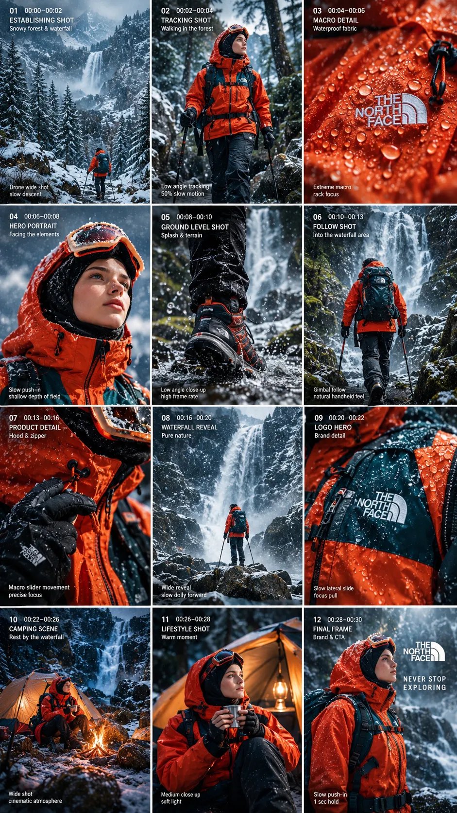
Create a cinematic, ultra-realistic outdoor adventure commercial for The North Face, showcasing an extreme winter expedition in the snowy mountains. Begin with close-up shots of rugged hiking boots crunching through fresh snow, then reveal a peaceful snow-covered pine forest with a small expedition tent. Cut to a lone mountaineer wearing a bright orange technical jacket trekking across a vast alpine landscape surrounded by majestic snow-covered peaks. Show a cinematic drone flying low over a frozen mountain stream, followed by boots stepping carefully across icy rocks near a powerful waterfall. Transition to premium product-focused shots of the mountaineer's orange waterproof jacket, detailed fabric texture, water droplets, waterproof zippers, adjustable straps, and technical buckles. Capture close-up portraits of a female mountaineer wearing an orange hooded jacket and ski goggles, with snow-covered mountains reflected in her goggles. Show her calmly drinking from a metal camping mug in the freezing wilderness. Finish with a dramatic full-body shot of the orange jacket against towering dark mountains, swirling snow, and moody cinematic lighting. Visual style: Premium outdoor brand advertisement, photorealistic 4K, vertical 9:16 composition, natural winter lighting, crisp snow textures, realistic fabric physics, subtle slow motion, smooth drone movements, shallow depth of field, dramatic wide-angle mountain shots, seamless cinematic transitions, cool blue and white color grading contrasted with vivid safety-orange clothing, professional commercial cinematography, realistic shadows, consistent character appearance, and high-end product photography. Mood: Adventurous, resilient, fearless, premium, and inspiring. Ending: A striking hero shot of the orange expedition jacket in a snowy mountain environment, with the tagline: “NEVER STOP EXPLORING.”
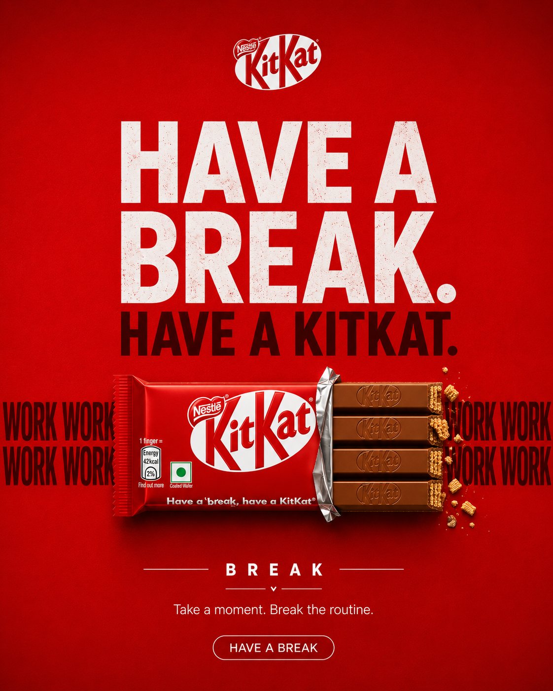
KITKAT — THE BREAK CREATIVE DIRECTION Create a premium, agency-level KITKAT advertising poster inspired by the visual language of the supplied reference campaign images: bold FMCG social advertising, strong graphic composition, oversized typography, controlled product photography, clean negative space, saturated brand colour, tactile realism and one instantly understandable visual metaphor. Do not copy any specific reference composition, layout or artwork. Extract the common creative principles and build an original KITKAT execution. The poster must feel like a real global FMCG campaign created by a senior art director and photographed by a premium commercial product photographer. Core idea: THE KITKAT LITERALLY CREATES THE BREAK. The visual should communicate the concept before the viewer reads the copy. ⸻ CAMPAIGN DNA Brand: KITKAT Product: Classic KITKAT 4-Finger Milk Chocolate Bar Campaign territory: Have a Break Concept: The Break Personality: playful, clever, youthful, confident, instantly recognizable Colour system * Dominant KITKAT red * Deep chocolate brown * White * Very subtle cream * Restrained dark red The red should create immediate KITKAT ownership without making the image look like a generic red advertisement. ⸻ CREATIVE IDEA — “THE BREAK” Build the entire poster around one graphic interruption. A continuous horizontal typographic rhythm runs across the composition: WORK WORK WORK WORK WORK WORK The repetition represents the endless pressure and routine of the workday. At the exact centre of the sequence, the rhythm is interrupted. The KITKAT occupies that interruption. The product should visually function as the missing section of the continuous line. The viewer should instantly understand: WORK → WORK → WORK → KITKAT → BREAK The KITKAT is not placed on top of the concept. The KITKAT IS the interruption. Make the relationship between typography and product feel physically constructed, as if the chocolate bar has literally broken the repeated word pattern. ⸻ CREATIVE EXECUTION Graphic visual metaphor + premium product hero + editorial FMCG poster Use: * oversized typography * product geometry * repetition * negative space * scale contrast * visual interruption * controlled shadows * strong alignment * premium product photography Avoid environmental storytelling. This must NOT look like a lifestyle photograph. ⸻ BACKGROUND Create a completely controlled studio advertising field. Use a rich, saturated KITKAT red background with subtle tonal depth. The background may contain: * extremely subtle paper/fabric texture * restrained radial falloff * very soft tonal gradients * faint dimensional shadowing Keep it fundamentally flat, graphic and intentional. No realistic environment. No room. No desk. No office. No architecture. No furniture. No landscape. No scenery. No decorative objects. ⸻ HERO PRODUCT Use the uploaded KITKAT product reference as the primary packaging reference. Preserve its recognizable packaging identity and proportions. Create a premium commercial interpretation of the classic KITKAT 4-Finger Milk Chocolate Bar. The product should sit horizontally across the centre of the composition, acting as the physical break in the typography. Partially unwrap the right side so the four chocolate fingers are visible. Packaging accuracy Preserve: * iconic KITKAT red wrapper * accurate white KITKAT wordmark * Nestlé branding where present on the reference packaging * four-finger format * authentic wrapper proportions * realistic wrapper folds * realistic printed packaging * believable foil * subtle material reflections * natural wrapper tension * accurate chocolate geometry Do not invent packaging details. Do not redesign the logo. Do not create a fictional KITKAT package. The uploaded reference is the visual source of truth for the product. ⸻ CHOCOLATE The exposed chocolate fingers must look physically real. Show: * four distinct fingers * embossed KITKAT detailing * realistic milk-chocolate colour * subtle tempering variation * crisp edges * visible wafer layers at the broken end * tiny natural wafer crumbs Use restrained crumbs only around the break. No chocolate splash. No melting chocolate. No floating chocolate pieces. No exaggerated CGI effects. The chocolate should look edible, tactile and premium. ⸻ TYPOGRAPHIC SYSTEM Typography is an essential part of the visual metaphor. Primary headline HAVE A BREAK. Secondary headline HAVE A KITKAT. Use a bold contemporary grotesk / heavy sans-serif typeface. Typography should feel like professional FMCG campaign typography, not a Canva template. Large scale. Tight but controlled spacing. Strong alignment. Minimal decoration. ⸻ “WORK” SYSTEM Place repeated WORK typography horizontally behind the KITKAT. Example: WORK WORK WORK WORK [KITKAT] WORK WORK WORK The product must interrupt the sequence. The words immediately surrounding the product should feel visually compressed toward the bar, reinforcing the idea that the KITKAT has physically stopped the repetitive rhythm. Use deep chocolate-brown or dark red typography so it remains integrated into the red background. Allow portions of the typography to disappear behind the product. The product must remain clearly readable. ⸻ COMPOSITION Format 4:5 vertical Create a premium Instagram advertising composition with strong visual hierarchy. Suggested structure: TOP Small KITKAT logo or restrained brand identifier. Large negative space. UPPER-MIDDLE Large: HAVE A BREAK. Below it: HAVE A KITKAT. CENTRE Repeated WORK typography. KITKAT bar physically interrupting the sequence. This is the visual hero. LOWER-MIDDLE Minimal conceptual lockup: — BREAK — BOTTOM Small supporting line: Take a moment. Break the routine. Optional restrained CTA: HAVE A BREAK Keep the bottom area clean. ⸻ VISUAL HIERARCHY The viewer’s eye should move in this order: 1. KITKAT product 2. Physical interruption / WORK → BREAK 3. HAVE A BREAK. 4. HAVE A KITKAT. 5. Minimal supporting copy Do not allow the typography to overpower the product. The product must remain the most important physical object. ⸻ TYPOGRAPHIC ART DIRECTION Take inspiration from the supplied references’ use of: * oversized headlines * strong type hierarchy * slightly condensed heavy lettering * subtle distressed texture * confident alignment * minimal supporting copy * graphic repetition * strong brand colour * editorial advertising layouts Do not replicate any particular reference. Typography should feel intentionally designed into the image from the beginning. ⸻ PRODUCT SCALE Make the KITKAT relatively large. It should occupy approximately 55–65% of the poster width. Position it horizontally with enough surrounding negative space to remain immediately recognizable. The chocolate should slightly overlap the repeated WORK typography. Use a soft, realistic contact shadow underneath the product so it feels physically present without becoming a floating CGI object. ⸻ LIGHTING Premium studio product photography. Use: * large soft frontal key light * subtle overhead fill * controlled side light * delicate rim separation * soft contact shadow * precise wrapper highlights * controlled chocolate reflections The product should have dimensionality while the background remains graphic. Avoid: * HDR * bloom * lens flare * blue-orange cinematic grading * artificial glow * excessive reflections * plastic-looking packaging ⸻ CAMERA / PHOTOGRAPHIC QUALITY Simulate premium medium-format commercial photography. Camera: Phase One XF IQ4 150MP Lens: Schneider Kreuznach 80mm macro / approximately 90mm equivalent Aperture: approximately f/8 for controlled product clarity Focus: critical focus across the packaging and exposed chocolate Rendering: extremely high micro-detail, natural perspective, smooth highlight roll-off, realistic material response The final product must resemble a professionally photographed FMCG packshot composited into a premium graphic campaign. ⸻ MATERIAL REALISM Wrapper Real printed flexible packaging with: * subtle creases * accurate folds * fine printed texture * controlled specular reflections * realistic foil transitions Chocolate Real milk chocolate with: * natural micro-texture * subtle imperfections * believable highlights * crisp molded edges * realistic wafer structure Background Premium matte red advertising surface with extremely subtle tactile texture. Everything must feel physically believable. ⸻ BRANDING The packaging itself is the primary brand identifier. Use only one additional KITKAT logo maximum, positioned with restraint. Do not scatter logos. Do not add fake brand badges. Do not create unnecessary legal copy. Do not use excessive hashtags. If used, a tiny #HaveABreak can appear in the upper corner as a secondary brand detail. ⸻ GRAPHIC DETAIL Introduce extremely subtle design refinement: * thin horizontal rules * small typographic dividers * restrained alignment marks * subtle red tonal variation * soft product shadow * minimal chocolate crumbs at the break These details must support the concept rather than decorate the poster. ⸻ POST-PRODUCTION Finish as a global FMCG campaign asset. Perform: * precision product compositing * accurate packaging rendering * realistic chocolate texture * controlled shadows * premium colour grading * micro-contrast refinement * subtle grain * clean typography * perfect alignment * high-resolution sharpening * realistic material integration No visible AI artifacts. Typography must be clean and intentional. Packaging must remain structurally accurate. ⸻ REFERENCE INTERPRETATION Use the supplied reference images as art-direction references, not as templates. Extract these qualities: Bold FMCG composition + strong product hero + oversized typography + saturated colour + visual metaphor + clean negative space + premium photorealism + social-media readability. The final design should feel like it belongs in the same high-end AI advertising / FMCG campaign ecosystem, while remaining completely original to KITKAT. ⸻ NEGATIVE DIRECTION NO environment. NO office. NO desk. NO kitchen. NO café. NO room. NO furniture. NO people. NO lifestyle scene. NO realistic location. NO stock photography. NO generic chocolate advertisement. NO chocolate splash. NO melted chocolate. NO floating chocolate pieces. NO excessive crumbs. NO CGI spectacle. NO smoke. NO particles. NO neon effects. NO dramatic scenery. NO complicated background. NO multiple concepts. NO visual clutter. NO excessive copy. NO fake logos. NO duplicated logos. NO distorted KITKAT packaging. NO malformed chocolate fingers. NO incorrect wrapper geometry. NO generic AI typography. NO Canva-template appearance. NO plastic-looking chocolate. NO fake HDR. NO excessive sharpening. NO oversaturation. ⸻ FINAL CREATIVE TEST Before finalizing, the poster must pass three tests: 1. Thumbnail test: At Instagram thumbnail size, the KITKAT and the visual interruption remain immediately recognizable. 2. One-sentence test: The concept can be explained simply: “The KITKAT literally creates the break in the endless WORK.” 3. Advertising test: It should look sophisticated enough to appear as a real global FMCG campaign, not an AI-generated product poster. FINAL MESSAGE THE PRODUCT IS THE BREAK.
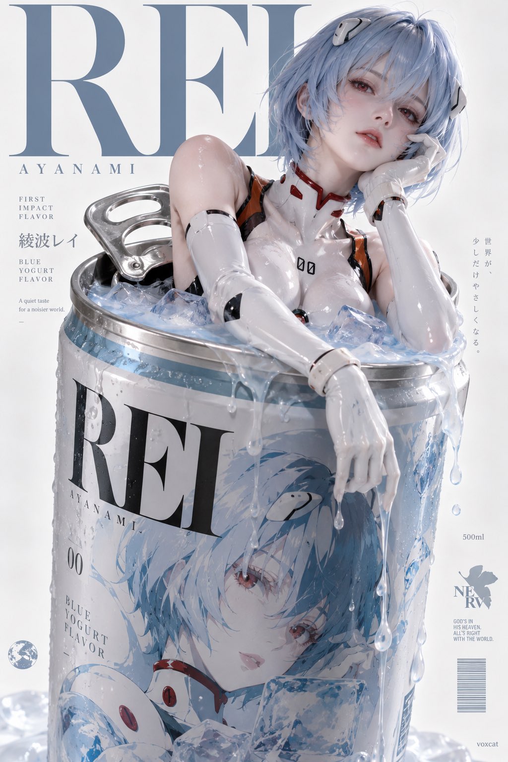
【角色】,surreal commercial advertising × character product endorsement × premium packaging design × editorial poster × photorealistic CG。 保留【角色】核心身份特征:发型、发色、眼睛、标志性服装、配饰与气质。角色以精致实体 CG 形态呈现,具有真实材质、清晰五官与鲜明个性。 固定构图: 2:3 竖版,巨型圆柱形易拉罐占据画面中央及下方约 70% 空间,角色从已经拉开的罐口探出上半身,与罐口、液体形成自然互动。 根据角色性格自由设计姿势、动作、表情与视线方向,例如倚靠、托腮、趴伏、撑起身体、伸手、回头、侧坐或慵懒地探出。允许大胆的身体倾斜、非对称构图与实验性镜头,保持角色与罐体之间明确的空间关系和真实接触。 包装设计: 易拉罐具有真实商业饮料包装结构:银色金属罐口、清晰拉环、圆柱罐身、精致印刷标签与金属反光。 罐身正面印有一幅巨大的【角色】二次元风格肖像插画,与上方实体角色形成呼应。根据角色身份自动设计饮料口味、包装配色、品牌图形与装饰元素。 罐口盛满与角色主色及身份相匹配的饮品,液体自然溢出,沿罐身流淌、飞溅、滴落,形成真实而富有设计感的流体造型。 海报版式: 纯白或浅灰摄影棚背景,画面上半部设置巨大的高对比度衬线英文字体,部分字形被角色遮挡,形成明确的前后层次。 角色头部主要位于画面上半区域,罐身包装占据下半区域。人物姿势与镜头角度自由变化,整体保持中央纵向视觉结构、大面积留白与高级商业广告的排版秩序。 高调商业棚拍光、真实金属反射、精致液体质感、细腻皮肤与服装材质,整体呈现超现实角色联名饮料广告的视觉完成度。 右下角极小 lowercase “voxcat” 签名。
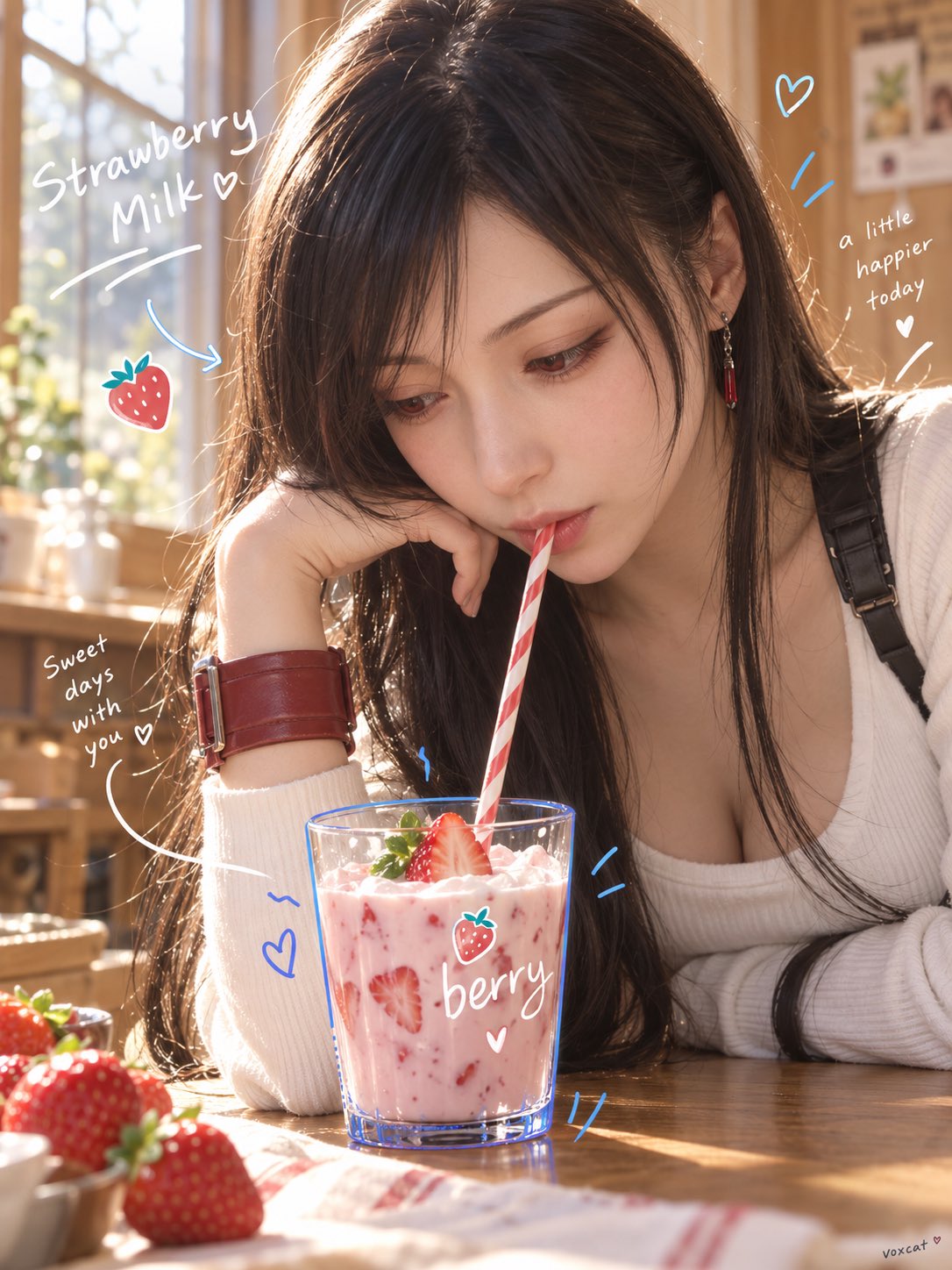
【角色】,明确成年真人化,保留角色核心身份:发型轮廓、发色、眼睛主色、脸部特征、角色主色与标志性气质。 暖色生活方式广告摄影 × 日常抓拍 × 手绘涂鸦商业视觉。 角色位于室内桌边或窗边,从斜前方近距离拍摄,相机位置略低于人物面部。角色身体自然前倾,头部低下并靠近前景中的【产品 / 饮料 / 食物 / 日常物件】,嘴部与物件发生直接互动,例如轻咬吸管、含住棒棒糖、咬住花茎、叼住包装边缘或其他自然动作。人物不正视镜头,注意力集中在正在互动的物件上。 前景产品或物件保持清晰完整,与人物形成明显大小和材质对比;细长吸管、花茎、丝带、线材或棒状物连接人物面部与前景物件,形成明确视觉路径。 暖色窗边自然光,柔和侧逆光,人物发丝与皮肤边缘带浅金色高光,背景为低信息量暖黄色、米色或木质室内空间,浅景深,真实生活方式摄影质感。 在照片表面加入少量白色手写字、蓝色手绘轮廓线、弧线、爱心、感叹号、箭头和小型涂鸦图标;涂鸦沿人物身体、动作轨迹和产品轮廓自然展开,像直接用马克笔画在照片上。整体像社交媒体生活方式品牌广告,轻松、可爱、真实、年轻。 竖版,右下极小 voxcat。
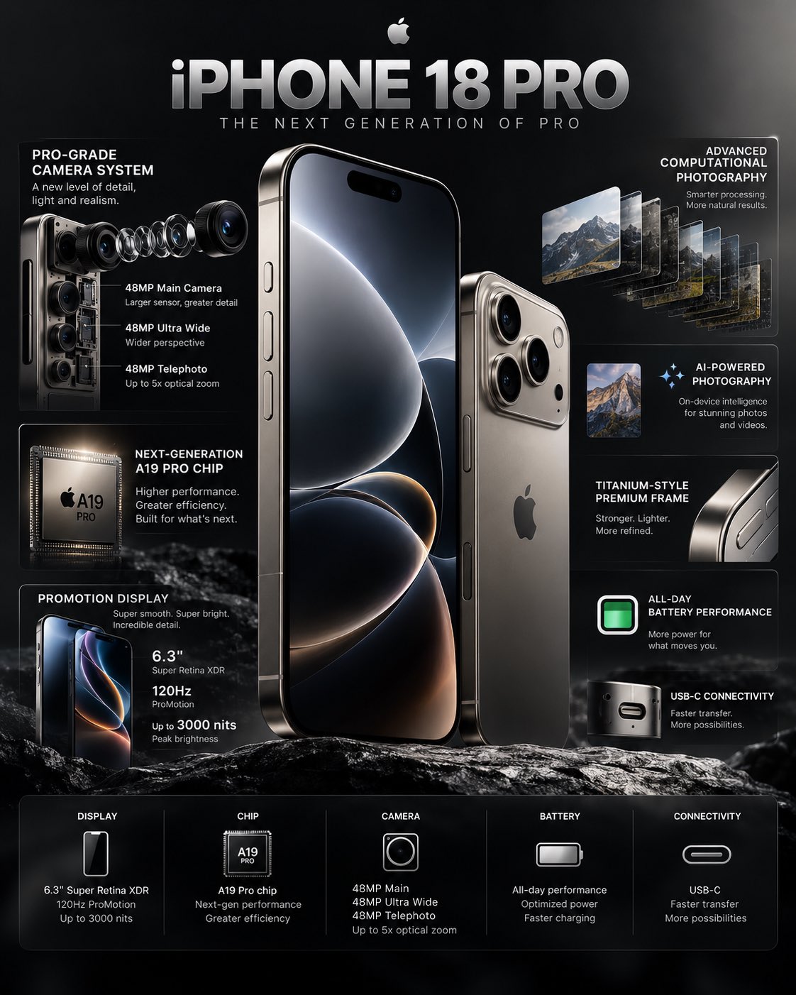
Create a premium, photorealistic 4K technology infographic showcasing the iPhone 18 Pro as the hero product. Design a sleek, high-end editorial infographic with a minimalist Apple-inspired aesthetic, dark graphite/black background, subtle metallic gradients, soft studio reflections, and precise technical callouts. Place a large iPhone 18 Pro vertically in the center, shown at a slight three-quarter angle with the front display and titanium-style frame clearly visible. Add a second smaller rear-angle view beside it to showcase the camera system. Around the phone, create clean infographic callouts connected with thin elegant lines and small technical markers. Highlight key features such as: • Pro-grade camera system • Advanced main camera sensor • Ultra-wide camera • Telephoto zoom • Next-generation A-series Pro chip • ProMotion high-refresh-rate display • Titanium-style premium frame • USB-C connectivity • Advanced computational photography • All-day battery performance • AI-powered photography and on-device intelligence Use clear, modern typography, strong visual hierarchy, restrained text, and realistic technical diagrams. Include subtle exploded-view details of the camera module and internal components without making the design look cluttered. Add a refined title at the top: “iPHONE 18 PRO” Subtitle: “THE NEXT GENERATION OF PRO” At the bottom, include a compact specification strip with categories such as: DISPLAY • CHIP • CAMERA • BATTERY • CONNECTIVITY Visual style: luxury technology advertising, premium product launch presentation, futuristic but believable, extremely clean composition, realistic materials, sharp details, controlled reflections, cinematic studio lighting, sophisticated black and silver palette, professional product photography, magazine-quality graphic design. Aspect ratio: 4:5 vertical Ultra-sharp, high-resolution, photorealistic, no unnecessary decorative elements, no distorted phone geometry, no messy typography.
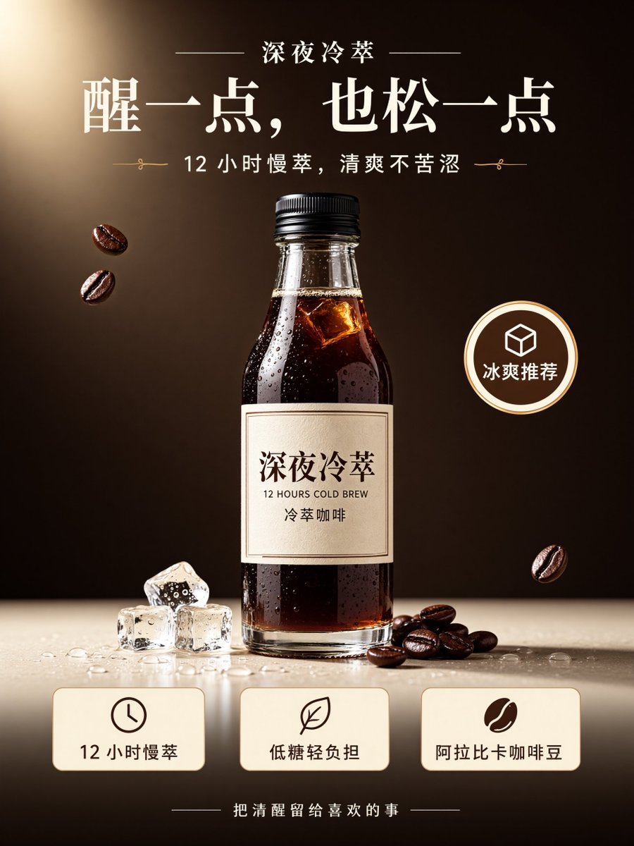
请设计一张精品冷萃咖啡产品宣传海报。 产品名称:深夜冷萃 主标题:醒一点,也松一点 副标题:12 小时慢萃,清爽不苦涩 画面中央放置一瓶透明玻璃瓶装冷萃咖啡,瓶身标签清晰显示「深夜冷萃」。 海报包含三个卖点信息卡:12 小时慢萃、低糖轻负担、阿拉比卡咖啡豆。 右侧加入一个圆形标签:冰爽推荐。 底部加入一句小字:把清醒留给喜欢的事。 整体采用高级商业广告风格,深棕色与奶油米白为主要色调,产品主体突出,排版简洁,有明显视觉层级。 所有中文文字必须清晰、准确、可读,不要乱码。 请将这张冷萃咖啡产品海报拆分为 4 个独立透明 RGBA 图层: Layer 1:标题文案层 Layer 2:产品主体层 Layer 3:卖点信息与标签层 Layer 4:背景与装饰层 每个图层保留透明背景和完整 Alpha 通道,不同语义元素尽量不要互相粘连,所有图层重新叠加后尽量还原原始海报。
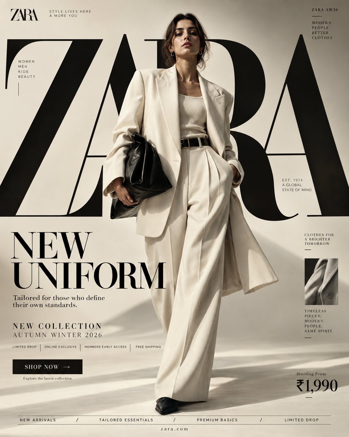
PROMPT — H&M “NEW UNIFORM” FORMAT Ultra-Premium H&M Fashion SMM Promotional Poster Vertical 4:5 Instagram Hero Creative Global Fashion Retail Campaign Contemporary Fashion Advertising Commercial Fashion Graphic Design Agency-Level Art Direction Behance Front Page Quality 8K UHD Hyper-Realistic Fashion × Graphic Design × Street Culture Fusion High-Impact Visual Communication Zero AI Slop Zero Generic Fast-Fashion Advertising Zero Catalogue Aesthetic Zero Luxury-Copycat Aesthetic ⸻ CORE STRATEGY This is not simply a clothing advertisement. This is H&M turned into a visual statement. The campaign should communicate: fashion moves fast. culture moves faster. H&M should feel: accessible + expressive + contemporary + youthful + global + confident. The visual language should combine: H&M fashion campaign × editorial magazine × street-culture poster × high-fashion graphic design × digital-first social advertising The result should feel unmistakably H&M, not Zara, Mango, COS or a generic luxury fashion brand. H&M’s own published style direction emphasizes dramatic contrast and in-the-moment photography, so the photography should feel alive rather than static. ⸻ CAMPAIGN IDEA “NEW UNIFORM” Forget traditional uniforms. This is: THE UNIFORM OF NOW. The clothes represent the constantly changing identity of a new generation. One day: minimal. Next day: street. Next: tailored. Next: experimental. H&M becomes the wardrobe that keeps up. The campaign message: THE UNIFORM CHANGES. YOU DON'T HAVE TO. ⸻ MASTER VISUAL Create an enormous typographic structure reading: H&M The typography should occupy approximately 60–70% of the entire composition. But unlike the MANGO concept, the H&M typography should feel: bold compressed graphic energetic slightly disruptive The giant H&M lettering can be: partially cropped, stacked, repeated, layered, hidden behind the model, intersected by red graphic blocks, cut by diagonal photographic frames, and pushed beyond the canvas. The typography should feel like a physical poster installation, not simple text. ⸻ HERO SUBJECT Young female fashion model. Contemporary global fashion appearance. Natural skin texture. Strong expressive face. Minimal but polished makeup. Confident expression. No artificial influencer smile. No exaggerated luxury pose. The model should feel like someone who actually belongs in the city. Youthful. Self-assured. Energetic. Culturally aware. ⸻ WARDROBE Create a contemporary H&M fashion look. HERO LOOK Oversized black leather-effect bomber jacket. Crisp white fitted tank. Relaxed wide-leg grey trousers. Chunky black footwear. Small silver jewelry. Structured mini shoulder bag. Subtle red accessory detail. Layered styling. The clothing should feel: accessible fashion elevated through styling. Not couture. Not runway costume. Not quiet luxury. Not excessive branding. The clothes should look genuinely wearable. ⸻ POSE / MOVEMENT The model is captured mid-stride. One foot forward. Jacket moving naturally. Hair slightly moving. Body turned approximately 15 degrees. Direct eye contact. One hand adjusting the jacket. Other hand relaxed. The image should feel like a moment captured rather than a pose performed. This directly aligns with H&M's published preference for dramatic, in-the-moment/action-oriented imagery. ⸻ COMPOSITION TYPOGRAPHY 60–70% MODEL 20–25% GRAPHIC / PROMOTIONAL INFORMATION 10–15% Visual hierarchy: H&M ↓ NEW UNIFORM ↓ MODEL ↓ COLLECTION INFORMATION ↓ CTA Create strong visual tension between the model and typography. The model should partially cover the giant letters. ⸻ H&M COLOR SYSTEM PRIMARY H&M RED Strong saturated red. Use approximately: #E50010 as the primary visual reference. BLACK #000000 Used for: typography, fashion, graphic blocks, borders, micro typography. WHITE #FFFFFF Used for: negative space, copy, graphic panels, background areas. The recognizable H&M visual palette is strongly associated with red, black and white. ⸻ COLOR RATIO 60% White / light neutral 20% Black 15% H&M Red 5% photographic natural tones The red should be strategic, not flooding the entire poster. Use red as a visual trigger. Red graphic rectangle. Red typography. Red edge strip. Red accessory. Red CTA. The eye should naturally travel toward the red elements. ⸻ BACKGROUND Create a contemporary urban studio environment. White architectural walls. Concrete floor. Large geometric panels. Sharp sunlight. Hard shadows. One massive H&M red architectural block. Black graphic planes. Subtle paper/poster texture. The environment should feel halfway between: fashion studio and urban billboard installation. No recognizable city. No distracting scenery. No luxury hotel. No generic streetwear alley. The graphic environment itself should create the H&M world. ⸻ GRAPHIC DESIGN SYSTEM Create an aggressive but controlled editorial grid. Use: bold horizontal rules, vertical lines, red rectangles, black blocks, oversized numerals, micro typography, cropped type, collection codes, thin borders, small directional arrows, photographic crop windows. Introduce a subtle poster-within-poster system. For example: a small secondary campaign image appears inside a red frame. Beside it: 01 / 04 NEW SEASON H&M WOMEN This gives the composition the feeling of a sophisticated global fashion campaign rather than a basic Instagram advertisement. ⸻ TYPOGRAPHY SYSTEM Use H&M's established typographic character rather than generic fashion fonts. PRIMARY HEADLINE Condensed, uppercase, bold display typography inspired by H&M's headline system. Extremely large scale. Tight leading. Minimal tracking. Hard geometric presence. H&M's published style guide identifies a condensed caps-only headline typeface for high-impact headlines, while IBM Plex Sans is used for longer supporting copy. SUPPORTING COPY Clean grotesk / sans-serif. IBM Plex Sans-style characteristics. Highly readable. Neutral. Modern. ⸻ TOP LEFT Small official-style H&M logo placement. Below: FASHION FOR EVERYONE Very small. Do not compete with the hero typography. Preserve generous clear space around the logo. H&M's published logo guidance stresses maintaining clear space and avoiding distortion or unsuitable treatment. ⸻ GIANT CENTER TYPOGRAPHY Massive: H&M Then layered behind it: NEW UNIFORM The giant H&M lettering should extend outside the frame. Crop: left side, top, right side. The typography should physically interact with the model. ⸻ CAMPAIGN TITLE Lower-left: NEW UNIFORM Use extremely bold condensed uppercase typography. Make UNIFORM substantially larger than NEW. Add a small red underline. ⸻ SUPPORTING COPY THE UNIFORM OF NOW. Secondary line: Designed for whatever comes next. Keep it short. No paragraph. No unnecessary marketing copy. ⸻ COLLECTION INFORMATION Small structured block: H&M WOMEN AUTUMN / WINTER 2026 COLLECTION 01 NEW SEASON FASHION / ESSENTIALS / STREET Use micro typography. ⸻ PROMOTIONAL STRIP Create a thin H&M red horizontal block containing: NEW ARRIVALS TRENDING NOW ONLINE EXCLUSIVE MEMBERS FIRST ACCESS White uppercase typography. The strip should feel integrated into the grid. Not like a sale banner. ⸻ CTA Bottom-right: SHOP NOW → Black rectangular button. White typography. Underneath: Explore the new collection Keep the button compact. ⸻ PRICE Bottom-right corner: FROM ₹999 Large enough to be commercially readable. But secondary to the fashion statement. Do not make the poster look like a discount advertisement. ⸻ BOTTOM FEATURE STRIP Thin black rule. Then: WOMEN / MEN / KIDS / DENIM / TRENDING / NEW ARRIVALS Centered beneath: ⸻ VERTICAL EDGE TEXT Right edge: H&M / AW26 Rotated vertically. Small. Precise. ⸻ RED GRAPHIC DEVICE Create one enormous H&M-red rectangle behind the model. Inside the rectangle: 02 Large black number. Underneath: THE NEW EVERYDAY This becomes the campaign's visual signature. The red block should feel almost like a piece of Swiss graphic design translated into contemporary fashion advertising. ⸻ PHOTOGRAPHIC STYLE High-energy fashion photography. Dramatic contrast. Sharp moment. Natural movement. Hard directional light. Deep shadows. Bright whites. Saturated H&M red. Natural skin. Realistic fabric. Subtle motion in clothing. H&M's published style guide specifically calls for dramatic contrast and captivating in-the-moment imagery, with action shots as the primary photographic direction. ⸻ LIGHTING Large directional studio source. Strong side lighting. Controlled hard shadows. Bright white highlights. Deep black clothing separation. Red surfaces receiving rich saturated light. Natural skin exposure. No beauty-dish glamour. No soft luxury haze. No excessive bloom. No artificial neon. ⸻ CAMERA ARRI Alexa Mini LF 50mm fashion/editorial lens Slightly low camera angle. Full-body composition. Fast-fashion campaign energy. Moderate depth of field. Extremely sharp clothing texture. Natural movement. High dynamic range. Premium commercial fashion photography. ⸻ POST-PRODUCTION Contemporary global fashion campaign grading. Clean whites. Deep blacks. Highly saturated controlled red. Natural skin tones. Subtle film grain. Visible textile texture. Crisp typography. Sharp graphic edges. Controlled contrast. No excessive retouching. No plastic skin. No artificial HDR. No fake luxury glow. No cinematic teal-orange grade. No excessive grain. ⸻ BRAND SAFETY / CONSISTENCY The final visual must immediately read as: H&M without relying solely on the logo. Brand recognition should come from: red / black / white bold condensed typography dramatic in-motion photography accessible contemporary styling graphic campaign language youthful global fashion energy strong commercial communication Do not make it resemble: ZARA's restrained editorial minimalism. MANGO's Mediterranean warmth. COS's architectural minimalism. Prada's intellectual luxury. Louis Vuitton's heritage luxury. The visual identity must remain H&M. ⸻ FINAL FEEL If: H&M × a global fashion magazine × a contemporary graphic design studio × street culture × a giant urban billboard created one campaign together. Not a catalogue. Not a generic fast-fashion ad. Not a luxury fashion imitation. Not a simple red-and-white poster. A high-impact H&M campaign where typography, movement, fashion and graphic design become one visual system. Vertical 4:5 — 8K UHD — hyper-realistic — dramatic in-the-moment fashion photography — H&M red/black/white palette — oversized condensed typography — precise editorial grid — realistic human anatomy — natural skin — detailed fabrics — accurate H&M branding treatment — crisp readable typography — premium commercial photography — agency-level art direction — Instagram hero creative — Behance front-page quality — print-ready.