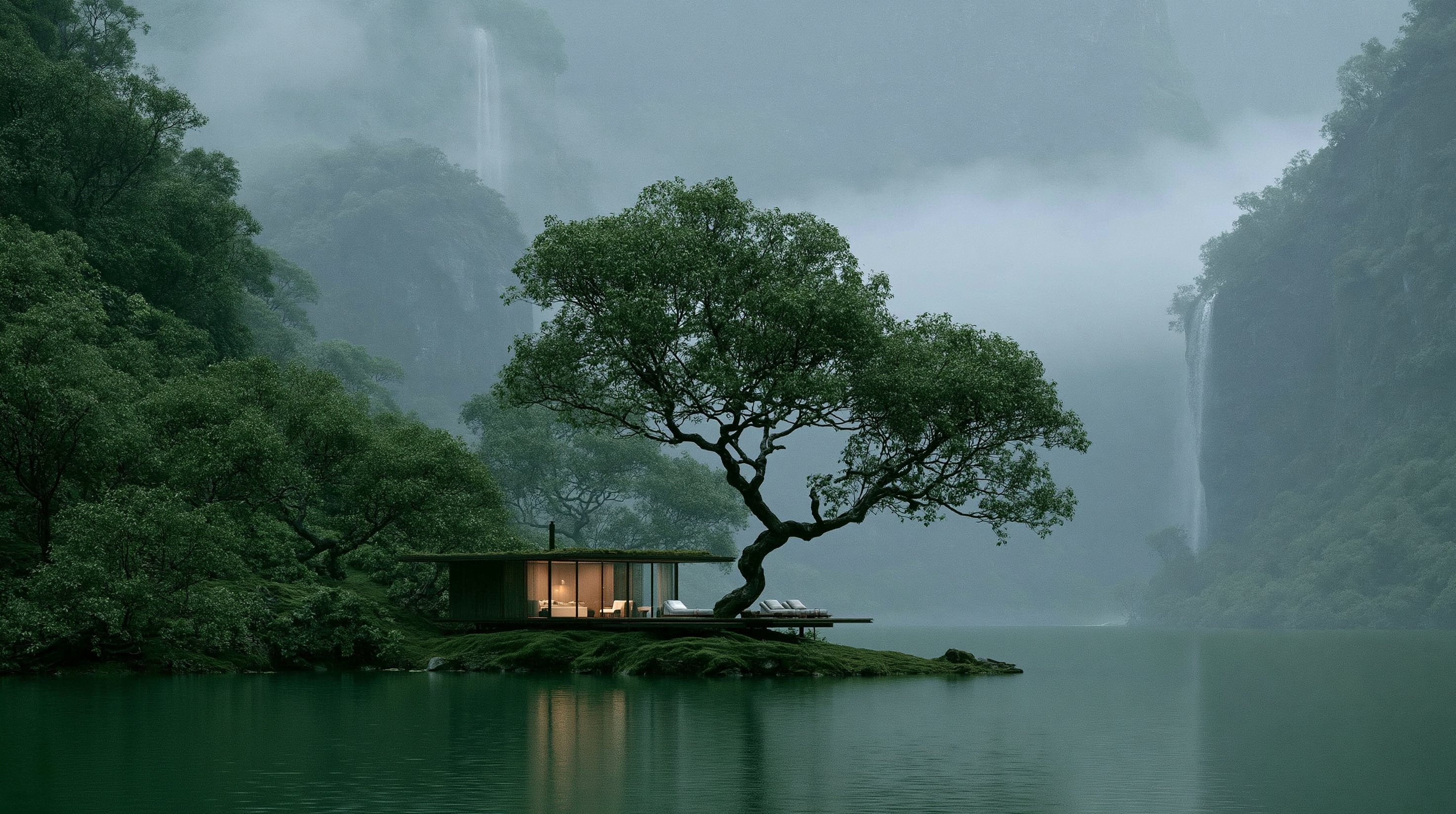
VELA Film: “A World of Its Own.” Campaign: “Stay somewhere bigger.” CREATIVE DIRECTION Create a 30.00-second cinematic hospitality advertisement for VELA, a fictional secluded lakeside retreat, using the supplied image as the visual source of truth. The landscape is the protagonist. Build the film as a continuous discovery of the retreat from twelve distinct perspectives. Every 2.50 seconds, reveal a genuinely new spatial experience: across the lake, beneath the tree, above the roof, inside the bedroom, along the waterline, through the glazing, beside the cliffs, from the lounge, within the canopy, along the pavilion, high above the valley and finally from beneath the ancient tree. The emotional rhythm alternates between grandeur and intimacy. Vast cliffs, waterfalls, mist, lake and ancient tree communicate scale. Warm timber, pale bedding, soft interior light, comfortable furniture and occasional glimpses of a family of four communicate refuge. Each cut should create the feeling: “What does it look like from there?” Then immediately answer from somewhere new. The overall tone is cinematic, premium, serene, immersive and deeply cozy. FORMAT 16:9 3840 × 2160 24 fps 30.00 seconds 720 frames 12 shots 60 frames per shot 2.50 seconds per shot Shot boundaries: 00.00 02.50 05.00 07.50 10.00 12.50 15.00 17.50 20.00 22.50 25.00 27.50 30.00 Use clean cuts throughout. Generate each shot independently with matching environmental, architectural and family continuity, then assemble the exact timing in the edit. VISUAL WORLD Preserve the supplied image’s defining composition and design language: an enormous spreading tree a mature twisting trunk moss-covered roots and rock a small isolated island a low single-storey modern pavilion a planted dark roof slim architectural framing large glass panels warm timber interiors a pale bed a right-side lounge jade-green lake water towering forest-covered cliffs multiple distant waterfalls dense atmospheric mist soft cool daylight warm interior illumination Keep the building visually modest beneath the enormous tree and cliffs. The tree should feel ancient, protective and monumental. The pavilion should feel refined, warm and human-scaled. Maintain the established relationship between pavilion, tree, roots, island, lake and surrounding valley. For elevated, lateral and interior views, extrapolate conservatively from the visible architectural language: low rectilinear geometry, dark structural frames, floor-to-ceiling glazing, warm timber surfaces and restrained contemporary furniture. Maintain the reference’s naturalistic cinematic finish, deep moss texture, atmospheric softness, cool green-blue distance, warm amber interiors and restrained highlights. Waterfalls move naturally through the mist. The lake carries subtle reflections and gentle surface movement. Leaves and smaller branches respond softly to the surrounding air. FAMILY PRESENCE Include a family of four as occasional human scale and warmth: mother, late 30s father, early 40s child around 10 child around 7 Wardrobe palette: cream warm grey muted rust deep navy natural linen soft knit textures Keep their appearance consistent throughout. Their presence is understated and observational. Use simple moments such as: a child near the glass parents seated together the family quietly looking toward the landscape one child curled comfortably into a lounge chair warm silhouettes inside the pavilion Their role is to make the architecture feel inhabited, comfortable and desirable while the landscape remains the central subject. CAMERA LANGUAGE Use each shot to provide genuinely new spatial information. Alternate between: extreme landscape scale human-scale interiors architectural geometry water-level perspective tree-canopy perspective elevated geography warm occupied spaces Camera movement should feel deliberate and restrained: slow dolly gentle lateral slide small crane movement subtle rise controlled aerial drift quiet push Keep movement smooth, architectural and contemplative. SHOT 01 | 00.00–02.50 ACROSS THE WATER 28 mm wide. Begin close to lake level from a position farther across the water than the original image. The ancient tree and low pavilion sit on the isolated island, surrounded by jade water and colossal mist-covered cliffs. Multiple waterfalls appear through layers of atmospheric depth. Use a slow forward drift just above the water. The retreat feels intimate against the enormous valley. SHOT 02 | 02.50–05.00 BENEATH THE TREE 24 mm. Move close to the island and look upward from beneath the spreading canopy. The moss-covered trunk rises prominently through the foreground while immense branches stretch overhead. The pavilion extends horizontally beside the roots. A distant waterfall appears through an opening in the branches. Use a gentle lateral slide. Make the viewer feel physically sheltered beneath the tree. SHOT 03 | 05.00–07.50 ABOVE THE ROOF 28 mm elevated perspective. Look diagonally downward from above the lower canopy. Reveal the pavilion roof, moss-covered island, twisting roots and water surrounding the retreat. Keep strong three-dimensional perspective so the pavilion, tree and shoreline remain clearly connected. Use a slow diagonal aerial drift. This shot communicates privacy and isolation. SHOT 04 | 07.50–10.00 INSIDE THE BEDROOM 35 mm. Move inside the pavilion. Frame the pale bed, warm timber wall and full-height glazing with the immense misty landscape beyond. One parent sits comfortably near the bed while one child stands quietly beside the glass. Cool daylight enters from the lake while warm interior light shapes the room. Keep the camera almost still with a very gentle inward push. The composition should make the bedroom feel like a protected viewing room within the wilderness. SHOT 05 | 10.00–12.50 AT THE WATERLINE 35 mm. Place the exterior camera centimetres above the lake from the side of the island. Moss-covered rock and twisting roots fill part of the foreground. The pavilion appears lightly suspended beside the water. Warm interior reflections shimmer beneath the glazing. Towering cliffs rise beyond. Track slowly along the waterline. Emphasize texture, proximity and scale. SHOT 06 | 12.50–15.00 THROUGH THE GLASS 65 mm. Look into the pavilion from an oblique exterior angle. Layer warm timber, family silhouettes and furniture behind subtle reflections of forest, mist and waterfall. Two family members sit comfortably while the others remain near the glazing. Allow the glass to combine interior warmth and exterior wilderness within the same composition. Keep the camera nearly still. The pavilion should feel like a softly illuminated refuge floating inside the landscape. SHOT 07 | 15.00–17.50 FROM THE CLIFF 40 mm. Shift to a lateral position near the base of one immense forest-covered cliff. Use wet rock or soft foreground vegetation for depth. A waterfall descends along one side of the composition. Across the lake, the island, tree and pavilion appear small against the monumental valley. Use a slow sideways camera movement. This is one of the film’s strongest statements of geographical scale. SHOT 08 | 17.50–20.00 THE LOUNGE AND THE VIEW 28–35 mm. Move inside the right-hand lounge from a completely new interior orientation. Frame comfortable furniture and warm timber in the foreground. Through the glazing, the jade lake disappears between mist-covered cliffs. One child sits curled comfortably in a lounge chair while the remaining family members appear naturally deeper in the room. Use an almost imperceptible push toward the glass. The landscape itself becomes the activity. SHOT 09 | 20.00–22.50 WITHIN THE CANOPY 24 mm. Position the camera high among the tree’s large branches. Use moss-covered limbs and leaves as strong foreground framing. Below, reveal part of the pavilion roof, island edge and surrounding lake. Beyond them, waterfalls descend through pale mist. Use a gentle floating crane movement between the branches. The tree feels like a vast natural roof protecting the retreat. SHOT 10 | 22.50–25.00 ALONG THE PAVILION 40 mm. Move close to one end of the glass facade and look lengthwise along the building. Use strong architectural perspective as the roofline, glazing divisions and floor geometry converge toward the far end. The ancient trunk anchors one part of the composition. Warm interior spaces create a rhythmic glow behind the glass. A few family silhouettes move gently within. Track slowly along the facade. This is the most architectural composition in the film. SHOT 11 | 25.00–27.50 ABOVE THE VALLEY 24 mm. Use the highest and widest perspective of the advertisement. Rise above and behind the island enough to reveal the immense lake corridor, forested cliffs, multiple waterfalls and layers of mist disappearing into the distance. The tree and pavilion occupy a small but recognizable position in the lower frame. Use a slow upward and backward aerial drift. This shot delivers the maximum sense of grandeur. SHOT 12 | 27.50–30.00 BENEATH THE ANCIENT TREE 35 mm. Finish from a close position beside the moss-covered roots, looking past the huge trunk toward the glowing pavilion and open lake. The trunk fills one side of the frame. The pavilion glows warmly beneath the canopy. The family appears as soft silhouettes inside. Beyond the glass and architecture, the lake extends toward pale mist and a distant waterfall. Use a slow lateral slide that settles into near-stillness during the final half-second. End with the relationship between immense nature and intimate shelter visible in one composition. MUSIC Create an original contemporary cinematic score with felt piano, muted strings, low harmonic texture and subtle plucked elements. 00.00–07.50 Begin sparsely with a single felt-piano tone, soft atmospheric harmony and natural water. 07.50–15.00 Introduce gentle muted strings as the film first enters the warm interior. 15.00–20.00 Expand the harmonic space as the landscape becomes more monumental. 20.00–25.00 Introduce a restrained low plucked pulse beneath the canopy and architectural movement. 25.00–27.50 Open into the score’s widest harmonic register for the high valley perspective. 27.50–30.00 Resolve into warmth and stillness as the final view settles beneath the tree. Keep the score elegant, spacious and emotionally restrained. SOUND DESIGN Build one continuous environmental soundscape that changes perspective with the camera. Across the lake: broad distant waterfalls, gentle water and open valley air. Beneath the tree: leaves, quiet water, soft dripping from moss and a closer sense of shelter. Inside: softened waterfall ambience through glass, subtle room tone, light fabric movement and timber presence. Beside the cliff: a broader, more immediate waterfall texture. Within the canopy: air moving gently through leaves and distant water below. High above: spacious wind and softened valley ambience. Use sound bridges across cuts to make all twelve perspectives feel like one connected environment. VOICEOVER Use one calm adult voice with warmth, confidence and spacious pacing. 02.75–05.00 “There are places you visit.” 13.00–16.00 “And places you enter.” 26.00–29.50 “Vela. Stay somewhere bigger.” Leave the remaining sections to music and natural sound. BRANDING Add typography during final editing. Opening identity: 03.00–04.75 VELA A private landscape retreat Use small warm-ivory typography placed within clear environmental negative space. Final identity: 27.75–30.00 VELA Stay somewhere bigger. Discover your stay. Use elegant warm-ivory typography with restrained spacing, strong legibility and generous margins. Keep the final landscape fully visible behind the brand. FINAL FEELING The film should feel like a thirty-second exploration of an entire private world. Every 2.50 seconds reveals a different relationship between architecture and landscape. The visual rhythm moves repeatedly between vast and intimate: lake tree roof bedroom water glass cliff lounge canopy architecture valley shelter The final impression is of extraordinary natural scale surrounding a small, warm place designed for living inside it.
灵感画廊
看真实作品,读完整提示词,也可以直接从模板开始。
提示词摘自 X (Twitter) 等公开社交媒体,版权归原作者所有。


 选效果 · 拼指令
#ad
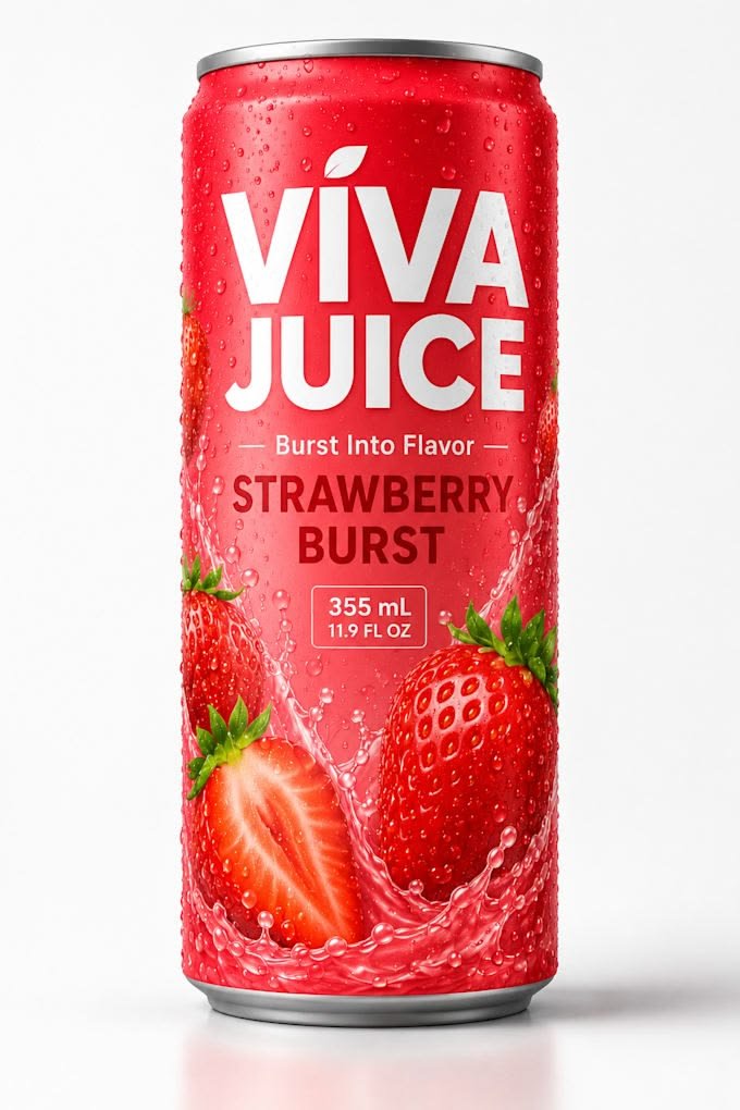
Analyze the product and create a high-resolution, photorealistic, professional advertising reference sheet containing these five sections, on a clean white/neutral studio background, premium commercial product photography, soft controlled lighting, realistic materials, sharp details, subtle shadows, and a professional editorial grid. 1. PRODUCT OVERVIEW; name, category, materials, dimensions/size, key features, and brand colors. 2. PRODUCT HERO VIEWS - front, back, side, 3/4, and functional view where relevant. 3. PRODUCT CLOSE-UPS - logo/label, texture/material, key components, packaging details, and other important identifying features. 4. PRODUCT USAGE / REAL-WORLD APPLICATION — show the exact product in its natural environment, being used correctly and at realistic scale. Include only essential interactions, accessories, or components; keep hands, labels, controls, and key features visible. Preserve the product’s exact design, proportions, branding, colors, materials, and construction, using a clean, believable composition with no clutter, exaggeration, misleading actions, or unnecessary props. 5. PACKAGING / CONSTRUCTION - relevant packaging or structural views where applicable. The entire sheet must function as a visual continuity bible for AI image/video production. Every product view must depict the exact same physical product with absolute consistency. Do not redesign, add variants, alter branding, or change proportions. Use cean typography, clear section labels, thin dividers, balanced spacing, sophisticated production-design aesthetic.
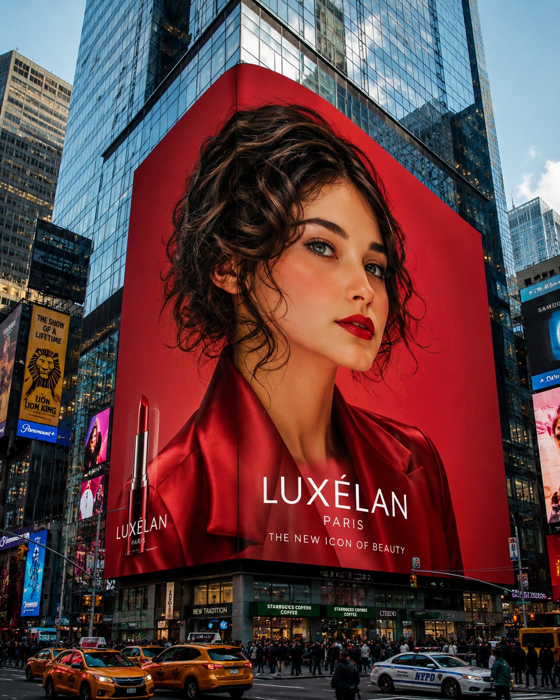
[Reference Image] Using the provided reference image, create an ultra-realistic mega-scale luxury beauty advertising campaign displayed on a massive 3D digital billboard wrapped around the corner of a modern skyscraper in Times Square, New York. The billboard dominates the city skyline and features a breathtaking high-fashion portrait of the same woman, styled like an iconic international cosmetics ambassador. The model has long, glossy dark chocolate-brown hair with voluminous waves, flawless porcelain skin, softly sculpted features, bold defined brows, warm hazel eyes, luxurious matte crimson lips, and a confident, elegant expression looking directly at the viewer. A subtle breeze lifts strands of her hair, adding cinematic movement. She wears a tailored satin-finish crimson red blazer with sharp lapels and sophisticated luxury styling. The billboard background is a rich monochromatic red gradient with dramatic editorial lighting that makes the portrait appear larger than life. The scene is photographed from street level with a wide-angle perspective, showcasing towering glass skyscrapers, urban architecture, reflections, traffic, pedestrians, and the enormous LED display seamlessly integrated into the building façade. The billboard should resemble a world-class luxury cosmetics campaign with premium branding aesthetics and polished commercial production quality. Capture the image in photorealistic 8K, ultra-detailed skin texture, premium hair rendering, cinematic daylight, high dynamic range, architectural realism, luxury fashion advertising, editorial beauty campaign, Times Square energy, hyper-realistic digital signage, and masterpiece-quality composition. Style Keywords: mega billboard, Times Square advertising, luxury beauty campaign, high-fashion editorial, cinematic cityscape, global cosmetics ambassador, photorealistic, premium commercial photography, architectural realism, 8K, ultra detailed. Negative Prompt low quality, blurry, pixelated billboard, distorted face, extra people on billboard, malformed anatomy, unrealistic proportions, duplicate subject, cartoon, anime, CGI look, poor lighting, watermark, random text, artifacts, noisy image, low resolution, oversaturated colors, plastic skin.
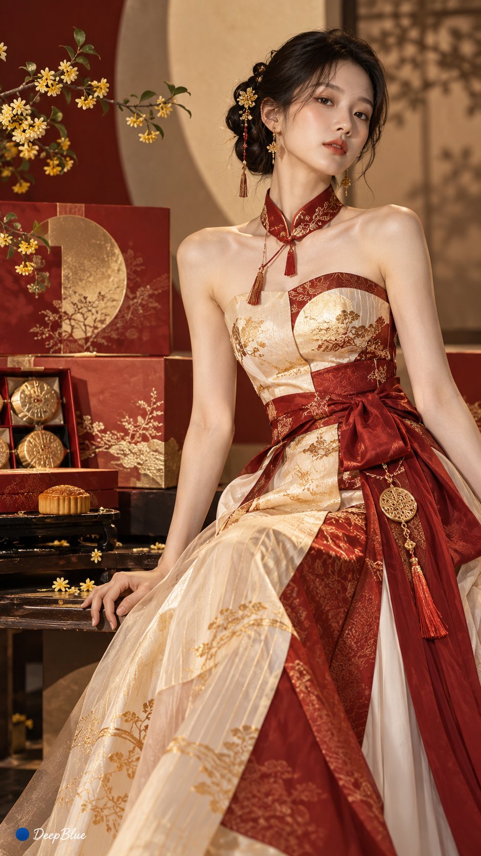
主体:XX × 核心特征提取 × 时装设计重构 提取主体最具辨识度的材质、纹理、色彩、形态与结构特征,将其重新转化为完整的时装设计语言。通过合理的面料组织、服装结构与细节设计完成自然转译,使最终服装能够清晰体现主体特征,同时保持真实、合理、可穿着的服装形态。整体采用真实时装摄影质感,材质自然,纹理清晰,结构明确,光影真实,避免直接复制主体形态、简单拼贴、复杂堆叠、过度装饰与人为制造的视觉效果。 以下4图主体分别是: 月饼礼盒、DeepBlue牌黄色胶带、尿素化肥袋、烟盒
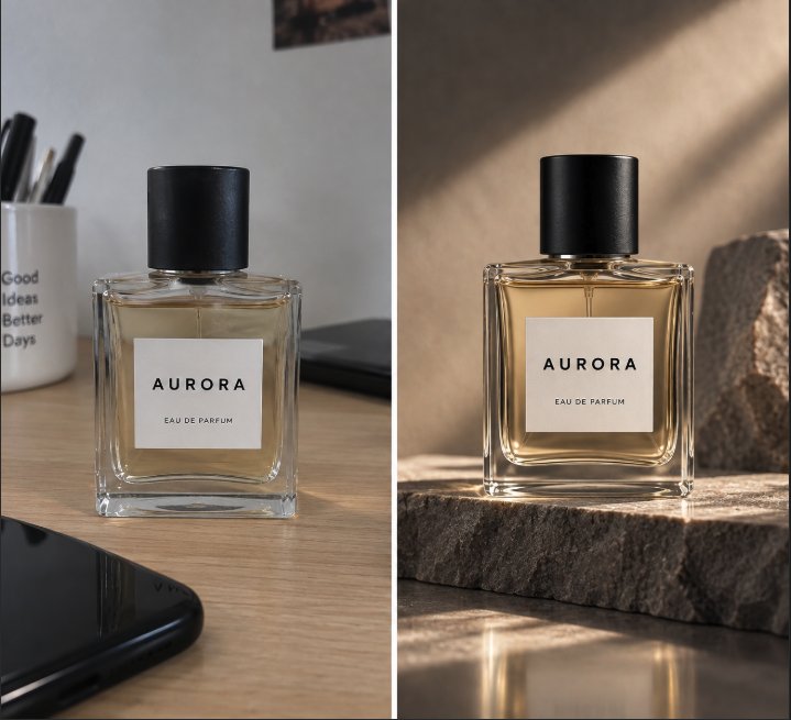
把这张照片变成专业的影棚产品图 保持产品完全不变: • 形状和比例 • 标志和文字 • 颜色 • 材质 • 细节 不要重新设计产品 去掉背景,换成极简的浅灰色背景 柔和的影棚灯光 自然的阴影 物理上真实的反射 高端商业摄影 85mm,f/8 4:5 比例 以这张照片为参考 保持产品完全不变: • 几何形状 • 材质 • 颜色 • 标志 • 按键 • 接口 • 细节 不要重新设计,也不要给产品添加任何东西 只改变照片本身: 极简背景 浅色石头底座 影棚侧光 自然的阴影 大量留白 高端科技广告的审美 要看起来像在专业影棚里真实拍摄的照片 不要文字 4:5 比例 以这张照片为参考 保持产品完全不变: • 形状和比例 • 包装 • 标签 • 标志 • 文字 • 颜色 • 材质 • 细节 不要重新设计产品 只把照片变成高端广告大片: 产品放在湿润的黑色石头上 电影感的侧光 深色背景 可控的反射 真实的小水珠 周围是虚化的、与产品相关的自然元素 浅景深 国际奢侈品牌广告的审美 要看起来像在影棚里真实拍摄的 不要添加文字 4:5 比例 以这张图为主要参考 我想为同一个产品做一组风格统一的电商照片 1. 正面,白底 2. 四分之三视角 3. 侧面视角 4. 材质特写 5. 产品使用中 6. 生活场景照 关键规则: 产品在视觉上必须完全一致 不要改标志、文字、尺寸、颜色、材质、按键、缝线或任何物理细节 只改变: • 相机 • 灯光 • 场景 • 构图 一张一张地生成,这样我可以在继续之前检查一致性 以这张照片为参考 保持产品完全不变: • 形状和比例 • 颜色 • 标志 • 文字 • 材质 • 瓶盖 • 细节 不要重新设计产品 把它放进一个真实的生活场景里: 黄金时段,地中海边的岩石上 温暖的夕阳从侧面照进来 背景是虚化的海和海岸线 自然的阴影 真实的小水珠 光线、透视和反射必须和新场景在物理上吻合 产品不能看起来像贴在背景上 高端杂志摄影 浅景深 竖版 4:5 比例 地中海 用这张产品照片,做出一个 Instagram 广告的视觉构图 产品: [产品] 客户: [目标客户] 目标: [转化 / 品牌认知 / 新品发布] 做一个包含以下内容的构图: • 清晰的视觉层级 • 产品是主角 • 给标题留出空白 • 专业的灯光 • 与价值主张相关的背景 重要: 产品必须和参考图完全一致 先不要写任何文字 只生成视觉构图 4:5 比例 用这张照片里完全相同的产品 我想探索 4 个创意方向: A. 极简高端 B. 未来感 C. 自然/有机 D. 奢华杂志风 先不要生成任何图片 针对每个方向,提出: • 概念 • 场景 • 灯光 • 构图 • 传达的感觉 然后问我想发展哪一个 等我选定后,再生成照片,产品必须和参考图完全一致 扮演一位专攻电商摄影的创意总监 我要上传一张我产品的照片 第一步: 仔细分析: • 几何形状 • 材质 • 颜色 • 标志 • 文字 • 独特细节 列出一份不能改变的元素清单 第二步: 问我: • 我卖什么 • 卖给谁 • 大概什么价位 • 品牌个性 • 图片用在哪里 第三步: 提出 5 个截然不同的摄影概念 每个都要说明 • 场景 • 灯光 • 构图 • 商业目标 第四步: 等我选定一个 第五步: 生成图片,同时保持第一步里确认的元素完全不变 不要编造照片里看不到的产品特征 给我做张好看的照片
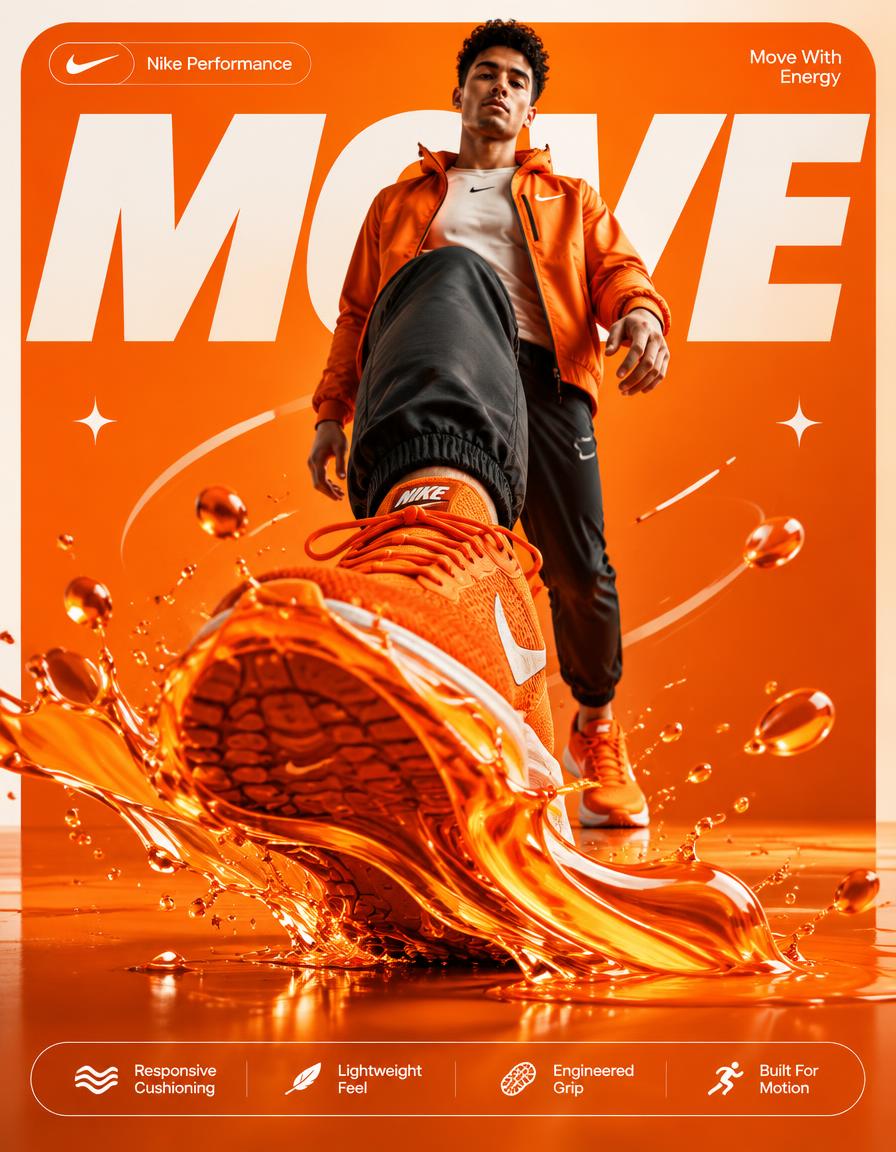
NIKE — “ORANGE MOTION” 4:5 vertical premium poster, 8K, bold commercial layout × surreal realism 🧠 CORE IDEA: “ENERGY IN EVERY STEP.” 🎬 LAYOUT: BACKGROUND BLOCK: Large rounded rectangle in vivid Nike orange with subtle tonal gradients and clean studio shadows GIANT TYPOGRAPHY: “MOVE” bold, oversized, cropped, sitting behind subject 👤 SUBJECT: Young adult athlete walking toward camera wearing orange Nike sneakers same foreground-dominant perspective one sneaker dramatically close to camera calm, confident expression 👟 PRODUCT + SURREAL TWIST: Orange Nike sneaker in foreground → A glossy orange liquid wave flows directly from the sole: * fluid wrapping naturally around the outsole * suspended droplets * sharp splash arcs * realistic reflections * subtle orange reflections across the sneaker The impact of the step creates a controlled liquid burst, making the sneaker appear to generate its own motion. ✨ GRAPHIC ELEMENTS: * sparkle icons ✦ * suspended droplets * subtle motion lines * soft reflections * minimal white accents ✍️ TEXT SYSTEM: Top pill: “Nike Performance” Small text: “Move With Energy” BOTTOM FEATURE STRIP: * Responsive Cushioning * Lightweight Feel * Engineered Grip * Built For Motion
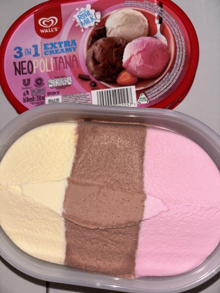
Analyze the product and create a high-resolution, photorealistic, professional advertising reference sheet containing these four sections, on a clean white/neutral studio background, premium commercial product photography, soft controlled lighting, realistic materials, sharp details, subtle shadows, and a professional editorial grid. 1. PRODUCT OVERVIEW; name, category, materials, dimensions/size, key features, and brand colors. 2. PRODUCT USAGE/HERO VIEWS - front, back, side, 3/4, and functional/use view where relevant. 3. PRODUCT CLOSE-UPS - logo/label, texture/material, key components, packaging details, and other important identifying features. 4. PACKAGING / CONSTRUCTION - relevant packaging or structural views where applicable. The entire sheet must function as a visual continuity bible for AI image/video production. Every product view must depict the exact same physical product with absolute consistency. Do not redesign, add variants, alter branding, or change proportions. Use cean typography, clear section labels, thin dividers, balanced spacing, sophisticated production-design aesthetic.
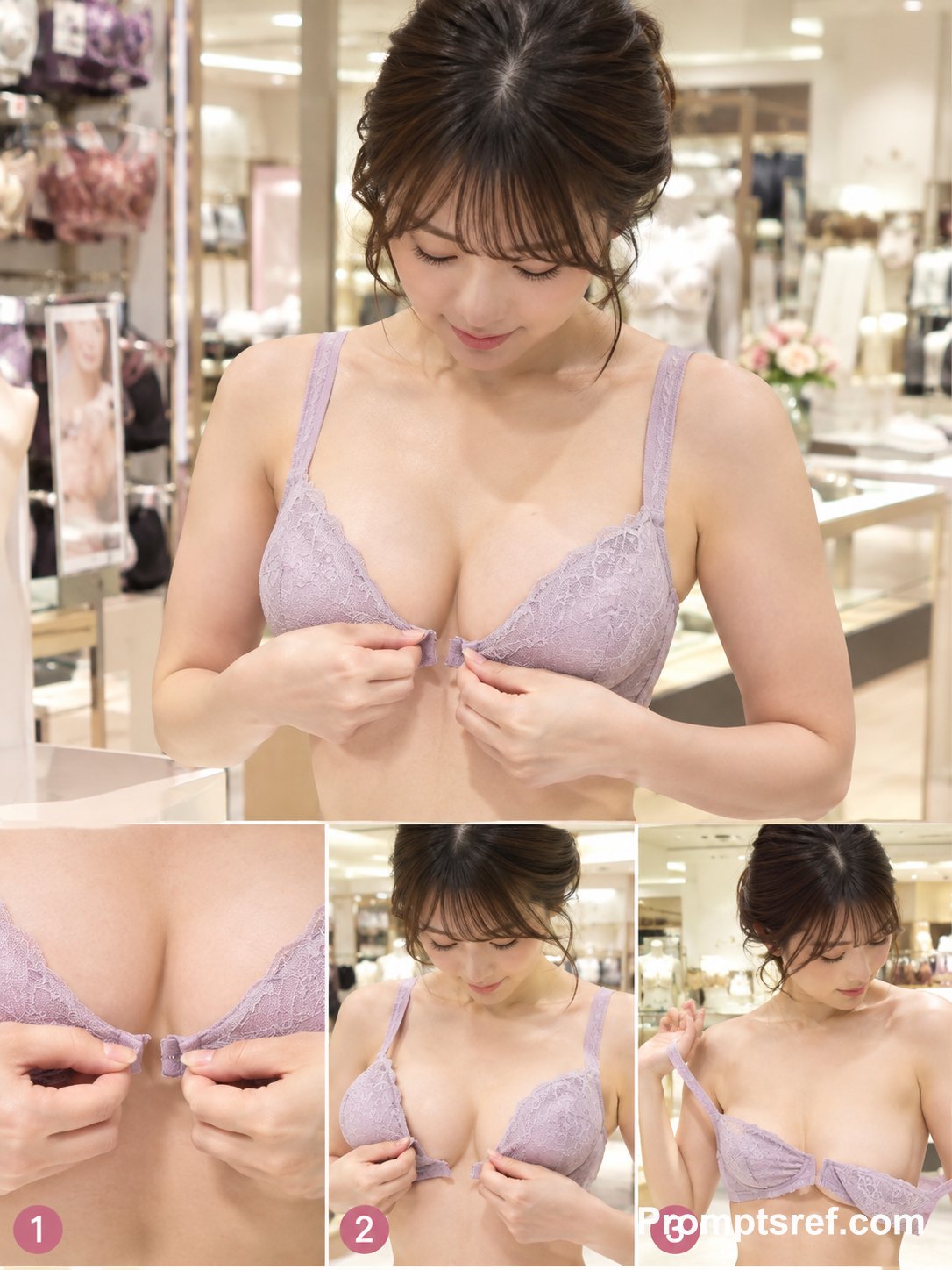
3:4縦長、デパートの売り場、実演販売、フロントホックの外し方を解説している、カメラ目線ではない、下を向く、自分で着けているもので実演する、外した後、斜め前からの構図、ピーチジョン ネガティブ: ロゴ、商品名、アウター
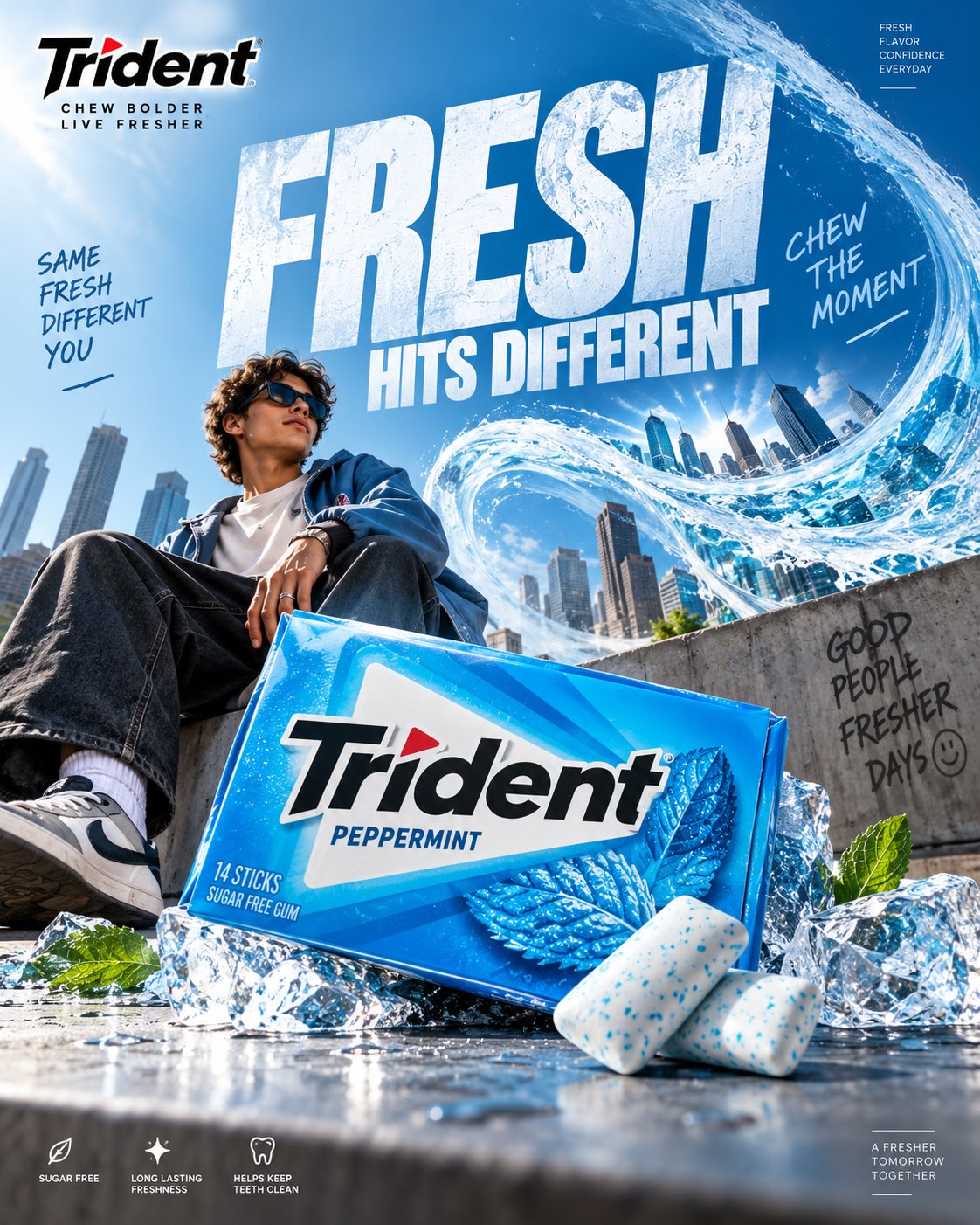
TRIDENT. Act as a Social Media Art Director and Digital Collage Artist specializing in high-end FMCG advertising, premium confectionery campaigns, commercial product photography, bold editorial compositions, surreal visual storytelling, and culturally relevant Instagram content. PHASE 1: CONCEPTUAL FRAMEWORK Create a premium Trident chewing gum advertising poster built around one instantly understandable visual idea. The advertisement should transform the simple act of chewing gum into a visually exciting experience. Think beyond conventional food advertising. Use a strong visual metaphor where freshness, flavor, confidence, connection, or an unexpected burst of sensation becomes a physical part of the environment. The creative idea must be: * Original * Visually surprising * Instantly understandable * Social-media optimized * Premium * Playful but sophisticated * Commercially believable * Strong enough to work without excessive copy Do not create a generic chewing-gum advertisement. Avoid random fruit explosions, generic mint leaves, floating products, excessive splashes, meaningless CGI, or stereotypical AI surrealism. PHASE 2: PRODUCT & PACKAGING Use the supplied Trident product packaging as the exact product reference. Preserve: * Exact package shape * Brand logo * Typography * Colors * Flavor name * Product proportions * Packaging graphics * Wrapper details * Material finish * Product quantity where visible The packaging must remain physically accurate and immediately recognizable. Make the Trident pack the hero object of the composition. If individual gum pieces are shown, maintain realistic proportions, wrapper construction, texture, folds, and material behavior. Never redesign the packaging or invent product claims. PHASE 3: CREATIVE VISUAL WORLD Build an imaginative physical environment around the Trident product. The environment should visually communicate the product benefit or flavor through a clever advertising metaphor. Examples of creative territory: * A wave of cool freshness physically transforming a city * A mint-powered breeze bending an entire environment * A giant flavor landscape emerging from one tiny piece of gum * A frozen world breaking apart around the product * A mundane social environment suddenly becoming vibrant * Architectural forms shaped by the movement of fresh air * An impossible miniature world contained inside the gum pack The visual world should feel intentionally art-directed, not randomly surreal. PHASE 4: BRAND COLOR & VISUAL IDENTITY Use Trident’s established visual identity as the foundation. Prioritize the actual product packaging as the primary color reference. Where appropriate, incorporate Trident’s recognizable cool cyan/blue visual territory with white and dark neutral contrast, while adapting the palette to the specific flavor SKU. Color should create: * Freshness * Energy * Cleanliness * Flavor recognition * Strong product separation Do not overload the artwork with unrelated colors. PHASE 5: PRODUCT COMPOSITION Create a sophisticated commercial product composition. The Trident pack should occupy a strong hero position with realistic scale, perspective, and contact with the environment. Use: * Dramatic perspective * Layered depth * Foreground elements * Midground product interaction * Atmospheric background * Intentional negative space * Strong visual diagonals * Controlled cropping The product must feel physically present inside the scene. Use realistic contact shadows, reflections, surface interaction, and material behavior. PHASE 6: GRAPHIC DESIGN & COLLAGE Combine premium FMCG photography with contemporary editorial graphic design. Introduce graphic elements only when they strengthen the concept: * Oversized typography * Flavor labels * Small technical information * Editorial numbering * Graphic lines * Cropped shapes * Repeated product details * Subtle geometric elements * Microcopy Create visual tension between photographic realism and graphic design. Avoid turning the poster into a template or a cluttered collage. PHASE 7: TYPOGRAPHY Create one short, memorable campaign headline connected directly to the visual idea. Possible direction: “CHEW THE MOMENT.” “FRESH HITS DIFFERENT.” “UNWRAP THE FRESH.” “FRESHNESS, UNLEASHED.” “FEEL THE FLAVOR.” “MAKE ROOM FOR FRESH.” Use bold, contemporary uppercase typography with strong editorial presence. Typography should become part of the visual composition. Allow oversized type to interact with the environment, overlap atmospheric elements, disappear behind objects, or extend beyond the frame where appropriate. Maintain perfect spelling, clean letterforms, strong hierarchy, and commercial readability. PHASE 8: BRAND INTELLIGENCE Maintain Trident’s core communication territory: * Freshness * Flavor * Everyday confidence * Social connection * Energy * Approachability * Contemporary culture * Playful sophistication Use the Trident logo correctly and prominently enough for immediate brand recognition without making the artwork feel like a packaging mockup. Do not imitate a specific existing Trident campaign. Create a completely original visual concept using the brand’s established identity. PHASE 9: SOCIAL MEDIA ART DIRECTION Format: 4:5 vertical Instagram poster. Design specifically for mobile viewing. The composition must: * Stop the scroll immediately * Communicate the idea within one second * Make the product recognizable at thumbnail size * Have one dominant focal point * Maintain strong contrast * Use clear visual hierarchy * Feel premium when viewed full-screen * Remain readable without zooming The artwork should look equally strong as an Instagram post, paid social advertisement, and campaign carousel cover. PHASE 10: COMMERCIAL FINISH Create the finish of a world-class FMCG advertising campaign. Use: * Photorealistic product rendering * Premium commercial lighting * Realistic packaging materials * High-detail textures * Controlled reflections * Accurate shadows * Natural depth of field * Sophisticated retouching * Subtle atmospheric detail * Sharp product edges * Print-quality detail Avoid: * Generic AI aesthetics * Plastic-looking packaging * Warped logos * Incorrect text * Fake product geometry * Duplicate products * Random objects * Excessive glow * Excessive particles * Cheap CGI * Over-saturated colors * Unnecessary visual clutter * Stock-photo appearance FINAL OUTPUT: Create a world-class Trident chewing gum social advertisement where the product, advertising idea, environment, typography, color system, photography, and graphic design feel conceived as one unified campaign. The final image should feel playful enough for social media, sophisticated enough for a global FMCG brand, and visually distinctive enough to be immediately recognizable in a crowded Instagram feed. Premium FMCG advertising. Bold visual metaphor. Photorealistic product. Editorial graphic design. Fresh, energetic, culturally relevant, scroll-stopping.
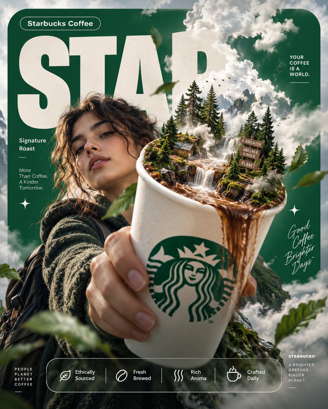
4:5 vertical premium poster, 8K, bold commercial layout × surreal realism 🧠 CORE IDEA: “YOUR COFFEE IS A WORLD.” 🎬 LAYOUT (INSPIRED BY SOURCE): BACKGROUND BLOCK: Large rounded rectangle in deep Starbucks green GIANT TYPOGRAPHY: “STAR” bold, cropped, sitting behind subject 👤 SUBJECT: Young adult holding Starbucks cup toward camera same perspective as reference (foreground dominance) calm expression, slight curiosity ☕ PRODUCT + SURREAL TWIST: Starbucks cup in hand → Inside the cup: - miniature forest ecosystem - tiny waterfall of coffee flowing - mist rising into sky Steam morphs into clouds above subject ✨ GRAPHIC ELEMENTS: - sparkle icons ✦ - soft fog layers - floating leaves ✍️ TEXT SYSTEM: Top pill: “Starbucks Coffee” Small text: “Signature Roast” BOTTOM FEATURE STRIP: - Ethically Sourced - Fresh Brewed - Rich Aroma - Crafted Daily
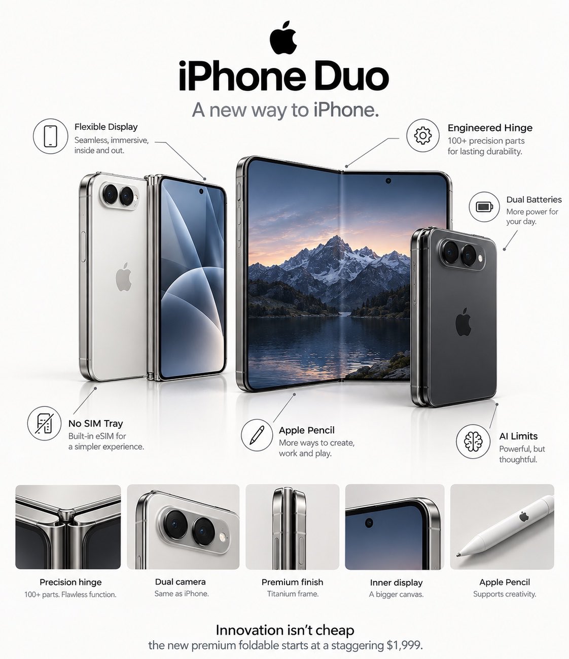
Create a premium photorealistic Apple foldable-phone concept infographic, inspired by the clean visual language of official Apple product presentations. Use a pure white background with a subtle glossy white floor and extremely minimal editorial composition. At the top, place a large bold black headline: “The iPhone Duo isn’t just ‘an iPhone that folds.’” Directly underneath, add a smaller elegant teal-blue statement: “It changes what an iPhone actually is.” Main product arrangement: Show two versions of the same foldable iPhone concept side by side. Left device: a slim silver/white foldable iPhone shown partially open, with one half displaying the edge-to-edge inner screen and the other half showing the premium glass rear panel. Use flat polished metallic edges, extremely thin bezels, rounded corners, a subtle central hinge, and a compact dual-camera module on the rear. Right device: a dark graphite/black version opened much wider, almost like a miniature tablet, displaying a beautiful dark mountain landscape wallpaper. In front of it, place the same phone folded/closed vertically, showing its dark glass back, centered Apple logo, and horizontally arranged dual-camera system. Make the hardware consistent across every view: identical proportions, camera placement, buttons, hinge design, materials and dimensions. The foldable mechanism should look physically believable and engineered rather than futuristic or exaggerated. Around the phones, add thin gray leader lines ending in minimalist circular technical icons, creating an Apple-style product breakdown: • NO FACE ID — small Face ID-style icon • 100+ HINGE PARTS — precision gear icon • 2 BATTERIES — battery icon • NO SIM TRAY — SIM-card icon • APPLE PENCIL — minimal stylus icon • AI LIMITS — minimalist neural/AI icon Place each label carefully around the devices with generous white space. Use black modern sans-serif typography, small gray icons, thin gray connector lines and one restrained teal accent color. At the bottom, add: Innovation isn't cheap the new premium foldable starts at a staggering $1,999. Visual style: ultra-realistic premium product photography + minimalist Apple-style technical infographic, sophisticated industrial design, realistic titanium/aluminum edges, glossy glass, precise reflections, believable hinge construction, soft studio lighting, subtle shadows, immaculate white space, perfectly balanced typography and composition. Composition: vertical 4:5, high-end technology editorial, centered products, crisp details, no clutter, no unnecessary futuristic effects, no cyberpunk aesthetic, no excessive glowing elements, no generic Android foldable styling. Make the entire image feel like a real leaked Apple product presentation/concept poster, while clearly remaining a fictional concept.
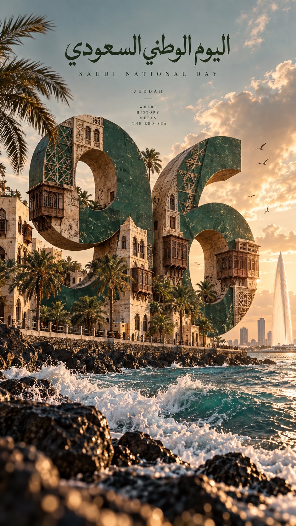
Create a premium cinematic vertical editorial poster celebrating Saudi National Day 96 through the visual identity of Jeddah, Saudi Arabia. The composition features a monumental oversized number "96" as the dominant central visual element, occupying most of the frame. The number should feel physically integrated into the environment rather than simply placed on top of the image. Create bold sculptural typography with realistic depth, architectural surfaces and subtle artistic textures. Blend the visual identity of Jeddah into and around the number "96". Feature the historic architecture of Al-Balad and Jeddah landmarks into the sculptural forms of the number. Use the green Saudi flag palette with elegant lighting, premium cinematic atmosphere, high detail.
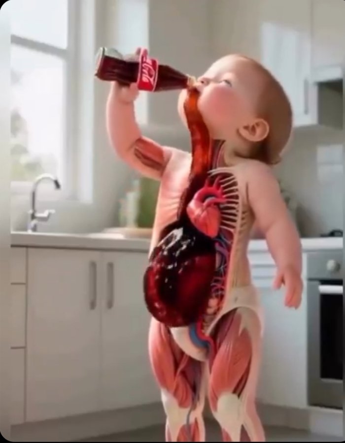
Cute baby drinks cola while a transparent anatomical view shows the drink moving through the body. Educational 3D animation, realistic organs, 4K, 9:16. Adorable baby with visible heart, stomach, and intestines, showing how cola affects the digestive system. Detailed medical 3D animation, smooth visuals, 4K, 9:16.
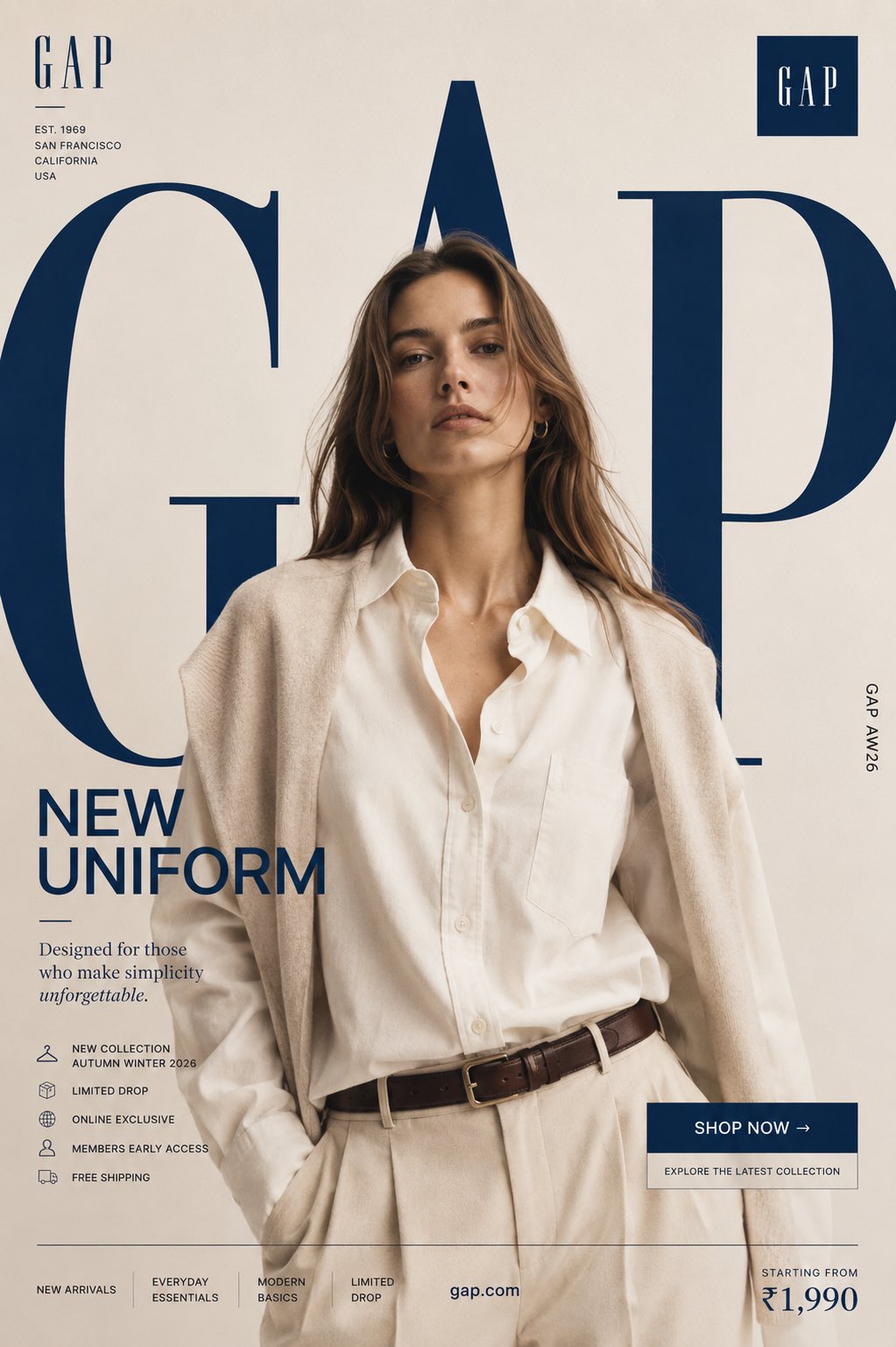
Prompt : GAP "NEW UNIFORM" FORMAT Ultra-Premium Fashion SMM Promotional Poster Vertical 4:5 Instagram Hero Creative American Lifestyle Fashion Advertising Commercial Fashion Graphic Design Agency-Level Art Direction Behance Front Page Quality 8K UHD Hyper-Realistic Fashion × Graphic Design Fusion Zero AI Slop Zero Generic Fashion Campaigns Zero Editorial-Only Aesthetic CORE STRATEGY This is not a fashion campaign. This is a lifestyle statement disguised as a promotional poster. The design should feel like Gap's flagship storefront, a premium lifestyle magazine cover, and a global billboard campaign merged into one visual. The graphic design is equally important as the fashion. Typography is not decoration. Typography is architecture. CAMPAIGN IDEA "NEW UNIFORM" Not office uniform. Not school uniform. The uniform of modern confidence. The clothes aren't being sold. The lifestyle is. MASTER VISUAL Massive oversized GAP typography dominates the entire composition. The word: GAP occupies nearly 75% of the canvas. Typography is integrated into the design. Letters extend beyond frame edges. Some letters cropped. Some hidden behind the model. Some functioning as compositional structures. The typography should feel monumental. The iconic GAP square logo appears subtly integrated within the layout. HERO SUBJECT Female model. Natural beauty. Confident expression. Minimal makeup. Effortless American luxury energy. No smiling. No dramatic posing. Relaxed confidence. Wardrobe: Oversized cream Oxford shirt. Relaxed tailored trousers. Premium neutral knit layering. Classic leather accessories. Elevated everyday styling. Modern American minimalism. POSE Model stepping through the giant typography. One foot slightly forward. Direct eye contact. Hands relaxed. Body partially intersecting typography. The feeling: She owns the moment effortlessly. COMPOSITION Typography occupies 70%. Model occupies 20%. Promotional elements occupy 10%. Visual hierarchy: GAP ↓ Model ↓ Promotion ↓ CTA Everything feels intentional. COLOR SYSTEM Primary: Cream Ivory Stone Soft Beige Navy Blue White Accent: Classic Gap Navy Muted Silver No bright colors. No trend-chasing palettes. Timeless restraint. BACKGROUND Clean luxury backdrop. Large soft gradient. Minimal studio environment. Subtle paper texture. No architecture. No scenery. No distractions. The design itself creates the environment. GRAPHIC DESIGN SYSTEM Floating collection cards. Lifestyle editorial labels. Minimal grid system. Thin lines. Micro typography. Premium retail campaign hierarchy. Global flagship-store energy. PROMOTIONAL ELEMENTS NEW COLLECTION AUTUMN WINTER 2026 LIMITED DROP ONLINE EXCLUSIVE MEMBERS EARLY ACCESS FREE SHIPPING Integrated naturally into layout. Not banner spam. TYPOGRAPHY HIERARCHY Top Left GAP small luxury wordmark Center Massive Typography G A P occupying most of composition bold heritage typography extremely large scale partially cropped Campaign Title NEW UNIFORM bold elegant typography Supporting Copy Designed for those who make simplicity unforgettable. PROMOTIONAL CTA BLOCK SHOP NOW → Explore the latest collection BOTTOM FEATURE STRIP NEW ARRIVALS EVERYDAY ESSENTIALS MODERN BASICS LIMITED DROP Bottom Right Starting From ₹1,990 Bottom Center https://t.co/BMlk4OUCl7 Vertical Edge Text GAP AW26 LIGHTING Luxury studio lighting. Large soft source. Editorial contrast. Natural skin rendering. Premium fabric highlights. Subtle shadows. Lifestyle campaign quality. CAMERA ARRI Alexa Mini LF 85mm Lens Commercial fashion photography Shallow depth of field Extremely sharp fabric rendering Ultra-premium advertising quality POST-PRODUCTION Premium American fashion campaign grading. Rich navy tones. Cream highlights. Visible textile texture. Natural skin detail. No excessive retouching. No artificial HDR. No fake luxury effects.
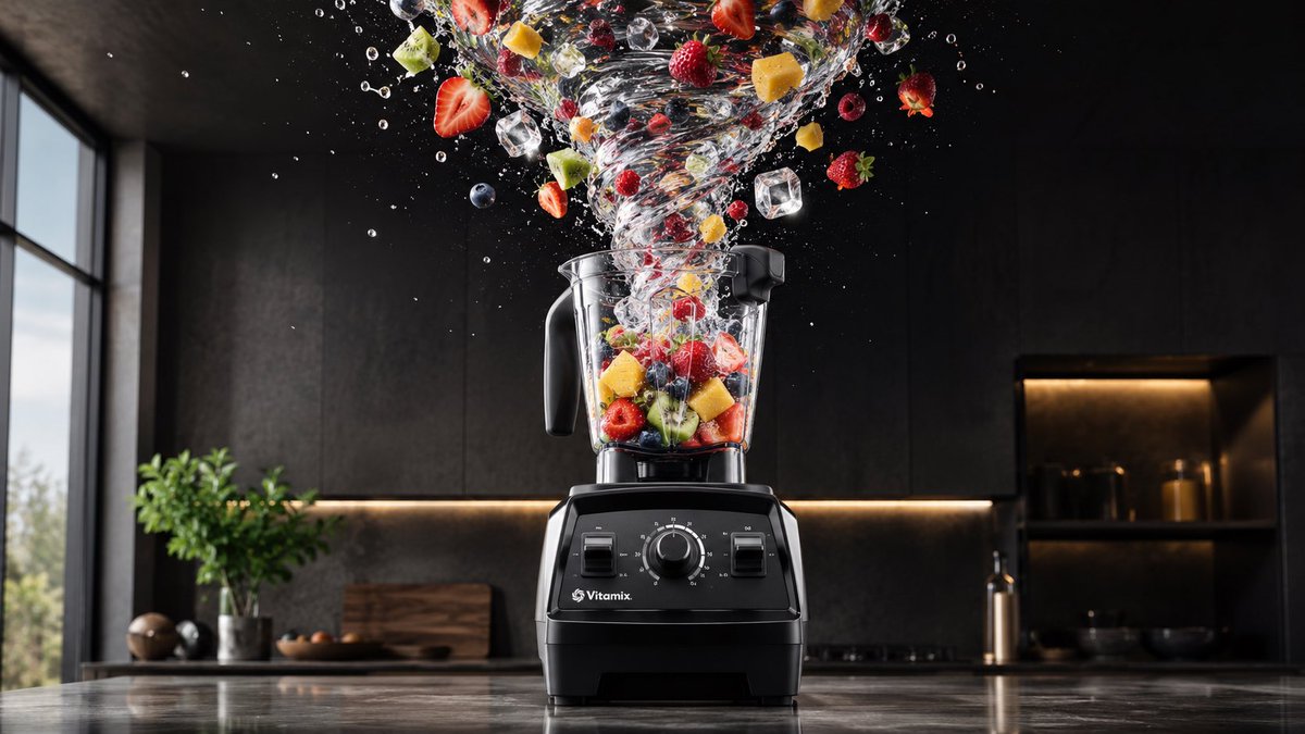
Upload a clear product image first. Create a premium 16:9 commercial advertising visual using the uploaded product as the exact hero reference. Visual system: “Break Gravity” Keep the product perfectly still, large, sharply focused, and instantly recognizable, occupying 35–45% of the frame. Preserve the exact product shape, materials, proportions, colors, logo, label, typography, and key brand details. The branding must remain clearly visible, readable, unobstructed, and naturally integrated into the product. Do not create a normal product beauty shot. Make the product’s core benefit pull the surrounding scene against gravity. Choose one impossible physical action directly connected to what the product does: • a blender pulls fruit, ice, and liquid upward into a suspended vortex • a vacuum lifts dust and debris from the floor into a controlled curved stream • a hair tool pulls tangled strands into smooth flowing ribbons • scissors pull paper fragments upward through one perfectly clean cutting path • a speaker bends particles and surfaces toward its sound • a cooling product pulls heat and vapor away from itself • a fragrance pulls petals, mist, and fabric into an elegant scent current The product must remain calm and motionless while everything affected by its benefit moves dramatically around it. Use only one clear gravity-breaking action. The effect must: start from the product, follow a readable direction, communicate the benefit in one second, frame the product without hiding it, and feel physically believable despite being impossible. Composition: strong foreground particles or materials, hero product in the midground, cinematic environmental depth in the background. Style: premium agency campaign, cinematic commercial photography, realistic physics and material behavior, high-speed frozen motion, dramatic directional lighting, tactile textures, sharp product detail, polished reflections, strong negative space, high contrast, scroll-stopping advertising composition. Avoid: random explosions, generic floating objects, multiple competing effects, hidden branding, unreadable labels, tiny product scale, miniature people, micro worlds, UI overlays, floating logos, extra text, clutter, or effects unrelated to the product benefit. Output: one polished 16:9 hero advertising image where the product stays perfectly still and its benefit breaks gravity around it.